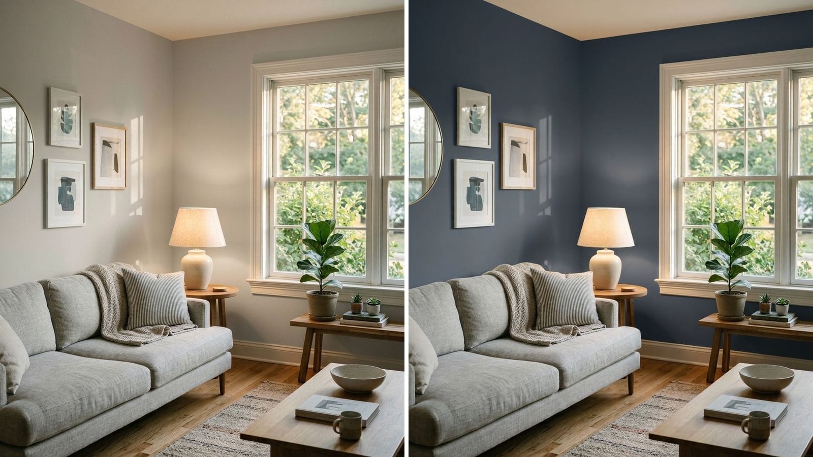
Paint looks different on the wall because almost nothing about the chip matches the room: the light has a different color temperature, a large painted area reads lighter and more intense than a small square, the sheen changes how dark the color looks, and the floor, trim and furniture next to it shift how your eye reads it. Two paints that match in the store can also split apart under your bulbs.
Below are the five reasons, what the research and the manufacturers say about each, and what to do about it. Paint names, codes and hex values come from the manufacturers' color data in Muro. A hex value on a screen is only an approximation, so a sample on your own wall always has the final say.
Reason 1: your light is not the store's light
Every light source has a color, measured in kelvin (K). The ENERGY STAR light bulb purchasing guide puts it simply: lower K means warmer, yellowish light, higher K means cooler, bluer light. The guide's scale runs like this:
| Bulb label | Kelvin | What it does to paint |
|---|---|---|
| Soft white, warm white | about 2200–3000K | Pushes colors toward yellow. Beiges and greiges warm up, cool grays lose their blue, blues can look duller. |
| Neutral white, cool white | about 3500–4100K | Closer to neutral. Common in kitchens and work spaces. |
| Daylight | about 5000–6500K | Bluish. Whites look crisp, warm colors can look flat, grays can look colder. |
A paint store, an office and your living room in the evening can sit at opposite ends of that scale. So the chip you liked under one light is not the color you see at home at 9 p.m.
Daylight changes too. A north-facing room gets indirect light from the sky all day, which is cooler. A south-facing room gets direct sun that runs warmer and brighter. If your room faces north, we covered which colors hold up in north-facing rooms. A south-facing room has its own list in best paint colors for south-facing rooms.
Reason 2: two paints can match in one light and split in another
This is called metamerism. Konica Minolta, which makes color measurement instruments, defines it as a pair of objects that match under one light source or set of viewing conditions, but not under another. It happens because different pigments reflect light differently across the spectrum, even when the overall color looks the same.
It matters most when you switch brands. Color matches between brands are measured in ΔE (delta E), a number for how far apart two colors are. Muro labels matches under 1 as practically identical. Here are close matches to Sherwin-Williams Agreeable Gray from four big brands in Muro:
| Brand | Color | Code | Hex | ΔE to Agreeable Gray |
|---|---|---|---|---|
| Sherwin-Williams | Agreeable Gray | SW 7029 | #D1CBC1 | — |
| PPG Paints | Whiskers | 1025-3 | #D1CCC2 | 0.55 |
| Benjamin Moore | Collingwood | 859 | #D3CEC4 | 0.85 |
| Behr | Mineral | UL170-15 | #D7D0C6 | 1.35 |
| Valspar | Villa Grey | 6005-1B | #D1CCBF | 1.61 |
A low ΔE is a very good starting point. But it describes the colors under standard viewing conditions, not under your bulbs. Two near-twins can drift apart at night under a 2700K lamp. If you swap brands, or touch up a wall with a different brand, put both samples side by side in the room and look at them in the evening too. Our analysis of 51,362 paint colors shows how often such twins exist.
This matters most if you're matching a color across brands or touching up an old wall.
Reason 3: a big wall reads lighter and more intense than a small chip
Color scientists compared small color patches with the same colors painted on real room walls. In their study, Colour appearance of room colours (Xiao et al., Color Research and Application, 2010), room colors looked lighter and more colorful than the small patches. The International Commission on Illumination (CIE) notes that real-life results don't always agree with lab tests, so treat it as a tendency rather than a rule. It is one reason a gray that looked calm on a 2-inch chip can look stronger across a whole wall.
The practical fix: if a color is almost right on the chip, test the next lighter one too. Here are three pairs from the same color family:
| You liked | Code | Hex | LRV (calc.) | Also test | Code | Hex | LRV (calc.) |
|---|---|---|---|---|---|---|---|
| Sherwin-Williams Mindful Gray | SW 7016 | #BCB7AD | 47.6 | Sherwin-Williams Repose Gray | SW 7015 | #CCC9C0 | 58.4 |
| Benjamin Moore Revere Pewter | HC-172 | #CBC6B8 | 56.5 | Benjamin Moore Pale Oak | OC-20 | #DDD9CE | 69.5 |
| Sherwin-Williams Agreeable Gray | SW 7029 | #D1CBC1 | 60.1 | Sherwin-Williams Aesthetic White | SW 7035 | #E3DDD3 | 72.7 |
The LRV here is calculated from the hex value, not the number the manufacturer prints. LRV (light reflectance value) tells you how much light a color bounces back, on a scale from 0 to 100. For what the number means and how to use it, read our guide to LRV.
Expect this most in large rooms, on walls with no furniture in front, and with colors that have visible undertones.
Reason 4: sheen changes how dark the color looks
The same color in a different finish is not the same color to your eye. Sherwin-Williams puts it this way: "The flatter a coating is, the darker a color will look," and the same color in a higher sheen will often appear lighter next to its flat version. Gloss also reflects lamps and windows, so from some angles you see glare instead of color.
The effect is easiest to see in dark colors, where a flat and a satin finish can look like two different paints:
| Brand | Color | Code | Hex | LRV (calc.) |
|---|---|---|---|---|
| Benjamin Moore | Hale Navy | HC-154 | #434B56 | 6.9 |
| Sherwin-Williams | Urbane Bronze | SW 7048 | #54504A | 8.1 |
Sample chips and most sample pots come in one finish, often flat or matte. If your wall will be eggshell or satin, the finished color can read a little lighter than your test patch. For a full rundown of finishes, see our paint finish guide. Peel-and-stick sheets have their own limits, covered in peel-and-stick samples vs sample pots vs an app.
It shows most on dark accent walls, cabinets and doors, or any color you plan to finish in satin or gloss.
Reason 5: the colors around it change what you see
A color never sits alone. Your eye reads it against the floor, the trim, the sofa and, during testing, the old wall color around the sample. This is simultaneous contrast, described by the French chemist Michel Eugène Chevreul in 1839: a color pushes its neighbors toward its opposite. A warm oak floor can make a gray wall look bluer. A bright white trim can make an off-white wall look dingy or yellow. A red brick fireplace can make a sage wall look greener.
In practice:
- A sample on an old color lies. A 1-foot square of greige in the middle of a yellow wall picks up a false blue cast. Paint your sample on white poster board, or leave a white border around it.
- Test next to the things that stay. Put the sample beside the floor, the trim and the biggest piece of furniture.
- Check the trim white. The trim color is part of the wall color. Our guide to white paint undertones explains how to pick one that doesn't fight the walls.
What to avoid when you judge a sample
- Judging under the store's lights. Take the chip home before you decide anything.
- One sample, one time of day. Look in the morning, at midday and at night with the lamps you actually use.
- Tiny samples. A chip the size of a stamp tells you almost nothing about a 12-foot wall. Go for at least 2 by 2 feet.
- Testing on the old color. Use white board or leave a white margin.
- Mixing bulbs in one room. A 2700K lamp next to a 5000K ceiling light makes the same wall look like two colors.
- Changing the finish after you test. If you sample in flat and paint in satin, expect a slightly lighter result.
How to check a color before you buy
- Fix the light first. Pick one bulb color temperature for the room and use it during testing.
- Make big samples on white board. Move them around: next to the window, in the darkest corner, beside the floor and trim.
- Compare the color you like with the next lighter one. A whole room usually reads stronger than the chip.
- Look at the samples for at least a day and an evening.
To narrow the list before you buy sample pots, you can try colors in Muro first. You take a photo of your own room, choose a real paint by name or code, for example from the tables above, and see it on your own walls. In the iPhone app you can switch between day, sunset and night, with the lamps on or off, which is exactly where chips and walls part ways. You can also start in your browser at app.usemuro.com. The screen is still an approximation, so the final check is a sample on the wall. The full method is in how to see a paint color in your room before you buy it.
FAQ
Why does my paint look darker on the wall than on the swatch?
Usually the room has less light than the store, or the light comes from one side and leaves part of the wall in shadow. A flatter finish also looks darker. If the color looks too heavy, test the next lighter one, for example Pale Oak OC-20 instead of Revere Pewter HC-172.
Why does my paint look lighter on the wall than on the chip?
On a large area, colors tend to look lighter and more intense than on a small chip. A higher sheen can also make the same color look lighter than its flat sample.
Why does gray paint look blue or purple on my wall?
Gray paints carry undertones, and cool light or nearby warm colors bring them out. North light and daylight bulbs push grays toward blue. A warm wood floor next to a gray wall makes it look cooler by contrast. A warm gray like Agreeable Gray SW 7029 is less likely to go blue than a cooler one.
What is metamerism in paint?
Two paints that match in one light but not in another. It happens because different pigments reflect light differently. It matters most when you match a color across brands, such as Agreeable Gray SW 7029 and PPG Whiskers 1025-3 (ΔE 0.55), so compare them under your own bulbs.
What light bulb is best for seeing true paint color?
There is no single true color. It always depends on your light. Test samples under the bulbs you will actually use. If you are choosing new bulbs, keep one color temperature per room, and note that ENERGY STAR calls 2200–3000K soft or warm white and 5000–6500K daylight.