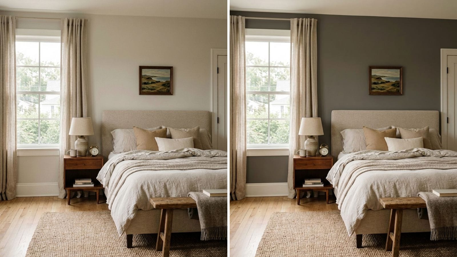
Accessible Beige (SW 7036) is a light, warm beige with a gray base, so it sits right on the line between beige and greige. Its hex is #D1C7B8 and its LRV works out to about 58, which makes it a touch darker and noticeably warmer than Agreeable Gray. It suits living rooms, bedrooms and north-facing rooms that need warmth, and it reads more khaki under cool light.
Codes, hex values and LRV come from the manufacturers' color data in Muro. A hex value on your screen is an approximation, so a sample on your own wall should make the final call.
What color is Accessible Beige?
| Brand | Color | Code | Hex | LRV (calc.) |
|---|---|---|---|---|
| Sherwin-Williams | Accessible Beige | SW 7036 | #D1C7B8 | 57.9 |
Break the hex down and you get red 209, green 199, blue 184. Red leads and blue trails by 25 points, which is what makes it warm. Green sits close to red, so the warmth leans yellow-tan rather than pink or peach. The three numbers stay fairly close together, and that's the gray in it.
The LRV in this post is computed in Muro from the manufacturer's hex. If you need the official number, check the Sherwin-Williams color page; a computed LRV and a published one can differ by a point.
What undertone does Accessible Beige have?
Warm, with a slight yellow-green lean that some people call khaki. You see it best against its neighbors, because they all have similar lightness and only the temperature changes.
| Brand | Color | Code | Hex | LRV (calc.) |
|---|---|---|---|---|
| Sherwin-Williams | Agreeable Gray | SW 7029 | #D1CBC1 | 60.1 |
| Sherwin-Williams | Worldly Gray | SW 7043 | #CEC6BB | 57.1 |
| Benjamin Moore | Revere Pewter | HC-172 | #CBC6B8 | 56.5 |
| Sherwin-Williams | Accessible Beige | SW 7036 | #D1C7B8 | 57.9 |
| Sherwin-Williams | Kilim Beige | SW 6106 | #D7C5AE | 57.4 |
Agreeable Gray has a 16-point gap between red and blue, so it still reads gray in most rooms. Worldly Gray sits between the two. Revere Pewter is about as dark as Accessible Beige but with a smaller red lead, so it looks grayer and a bit greener. Kilim Beige is the step past Accessible Beige: a 41-point gap, clearly beige, with some peach in it. If Accessible Beige looks too gray on your wall, Kilim Beige is the next one to sample. More colors in this range are in best beige paint colors.
Light shifts all of this. Cool north light pulls Accessible Beige toward a flat khaki, warm bulbs push it toward a soft tan.
Accessible Beige vs Agreeable Gray
The two have almost the same lightness (57.9 against 60.1), so neither will make a room much darker than the other. The difference is temperature. Agreeable Gray is a gray that leans warm. Accessible Beige is a beige that leans gray.
Pick Agreeable Gray if your furniture and floors are cool or neutral, or if you want the walls to stay quiet in a south-facing room. Pick Accessible Beige if your room faces north, if you have warm wood or cream fabrics, or if Agreeable Gray looked cold on your sample. Our Agreeable Gray review covers that color in the same detail.
What does LRV 58 mean in a real room?
LRV goes from 0 for black to 100 for pure white. At about 58, Accessible Beige reflects a little more than half the light that hits it. In a bright room it looks like a light, warm neutral. In a dim hallway or a room with one small window it reads as a mid tan, darker than the chip suggests, because less light bounces back off the wall.
If you like the color but your room is dark, try a lighter version of the same idea before you switch families. Canvas Tan (SW 7531) is at 64.6 and Natural Linen (SW 9109) at 66.2. For a darker version, Balanced Beige (SW 7037) drops to 45.7 and works on an accent wall or in a big, bright room.
| Brand | Color | Code | Hex | LRV (calc.) |
|---|---|---|---|---|
| Sherwin-Williams | Natural Linen | SW 9109 | #DFD3C3 | 66.2 |
| Sherwin-Williams | Canvas Tan | SW 7531 | #DCD1BF | 64.6 |
| Sherwin-Williams | Balanced Beige | SW 7037 | #C0B2A2 | 45.7 |
Which rooms does Accessible Beige work best in?
North-facing rooms. It has enough warmth to keep cool light from turning the walls gray and cold. See more options in north-facing room paint colors.
Living rooms and open plans. It runs well through connected spaces and goes with oak, walnut, cream upholstery and brass.
Bedrooms. Under bedside lamps it turns into a soft tan. That's a good thing if you want the room to feel warm at night.
Kitchens and baths with warm finishes. Creamy tile, wood cabinets and travertine all suit it. Next to bright white marble with gray veins, it can look dirty, so check it against the stone first.
What white trim goes with Accessible Beige?
A soft, slightly warm white keeps the contrast clean without making the beige look muddy. A very cool white does the opposite.
| Brand | Color | Code | Hex | LRV (calc.) |
|---|---|---|---|---|
| Sherwin-Williams | Alabaster | SW 7008 | #EDEAE0 | 82.2 |
| Sherwin-Williams | Greek Villa | SW 7551 | #F0ECE2 | 84 |
| Sherwin-Williams | Pure White | SW 7005 | #EDECE6 | 83.7 |
| Sherwin-Williams | Shoji White | SW 7042 | #E6DFD3 | 74.3 |
Alabaster and Greek Villa are the easy picks. Pure White gives a crisper line and still doesn't fight the beige. Shoji White is low-contrast: use it on trim if you want everything to blend, or on the ceiling of a room painted Accessible Beige.
Which dark colors go with Accessible Beige?
For a front door, a kitchen island, built-ins or a feature wall, earthy darks look the most natural next to it. Navy works too, for stronger contrast.
| Brand | Color | Code | Hex | LRV (calc.) |
|---|---|---|---|---|
| Sherwin-Williams | Urbane Bronze | SW 7048 | #54504A | 8.1 |
| Sherwin-Williams | Roycroft Bronze Green | SW 2846 | #575449 | 8.8 |
| Sherwin-Williams | Iron Ore | SW 7069 | #434341 | 5.6 |
| Sherwin-Williams | Naval | SW 6244 | #2F3D4C | 4.5 |
Urbane Bronze and Roycroft Bronze Green share the same olive-brown warmth, so the room feels like one palette. Iron Ore is a soft near-black for doors and window frames. Naval is the one cool color here and gives the most contrast.
What are the Accessible Beige twins in other brands?
If your store doesn't sell Sherwin-Williams, these are the closest matches in Muro's database. ΔE measures the visible difference between two colors: under 1 is practically the same, under 2 is very close.
| Brand | Color | Code | Hex | ΔE |
|---|---|---|---|---|
| Behr | Shoreline Haze | MQ6-31 | #D0C7B8 | 0.50 |
| Vista Paint | Whale Bone | C-202 | #D1C8B9 | 0.54 |
| Benjamin Moore | Litchfield Gray | HC-78 | #D5CABB | 0.93 |
| Valspar | Oatbran | 6006-1B | #CEC4B3 | 1.17 |
Behr Shoreline Haze is the closest match on the list. Litchfield Gray is the Benjamin Moore pick and comes out a hair lighter. These match the color, not the paint, so sheen and coverage still depend on the product line. For touch-ups on a wall that's already painted, sample even a ΔE under 1. More on how this works in paint color twins across brands.
What to avoid with Accessible Beige
- Bluish white trim. Next to a cold white, Accessible Beige looks dingy and more yellow than it is.
- Cool gray in the next room. A blue-gray next door makes both colors look wrong. Keep connected rooms on the same temperature.
- Orange wood floors without a test. Honey oak pulls it toward a muddy yellow-green. Tape the sample right above the baseboard.
- Gray-veined white marble. The cool stone makes the warm wall look dirty.
- A windowless room. At LRV 58 with no daylight, it turns into a heavy tan. Go lighter.
How to check a color before you buy
- Paint two sample boards and move them between a sunny wall and a shaded one. The same paint can look like two colors.
- Look at them morning, afternoon and evening with the lamps on. Accessible Beige changes more with bulb color than most neutrals.
- Hold them against your trim, floor and biggest piece of furniture. You never see a wall color on its own.
Before you buy any samples, you can narrow the list in Muro. Take a photo of your room, pick a real paint by name or code, say Accessible Beige SW 7036 or Behr Shoreline Haze, and see it on your own walls. The iPhone app lets you switch between day, sunset and night, with lamps on or off. You can also start in the browser at app.usemuro.com.
When the color is settled, the paint calculator tells you how many gallons to buy.
FAQ
Is Accessible Beige warm or cool?
Warm. Its hex #D1C7B8 has red 25 points above blue, with green close to red, so the warmth leans tan rather than pink. It is warmer than Agreeable Gray (SW 7029) and cooler than Kilim Beige (SW 6106).
Is Accessible Beige gray or beige?
Mostly beige, with enough gray to keep it calm. In bright, warm light it reads as a light tan. In cool north light it can look like a khaki greige.
What is the LRV of Accessible Beige?
Computed from the manufacturer's hex, Accessible Beige SW 7036 has an LRV of 57.9, so it reflects a bit more than half the light. Check the Sherwin-Williams color page for the official figure.
Does Accessible Beige look green?
It can, slightly. Its green value sits close to its red value, so next to orange wood, green foliage outside the window or cool north light it can take on a khaki cast. Test it beside your floor.
What is the Benjamin Moore equivalent of Accessible Beige?
In Muro's database the closest Benjamin Moore color is Litchfield Gray (HC-78), ΔE 0.93, which is practically identical and a touch lighter.
What is the Behr version of Accessible Beige?
Behr Shoreline Haze (MQ6-31), ΔE 0.50. You won't see the difference on a wall.