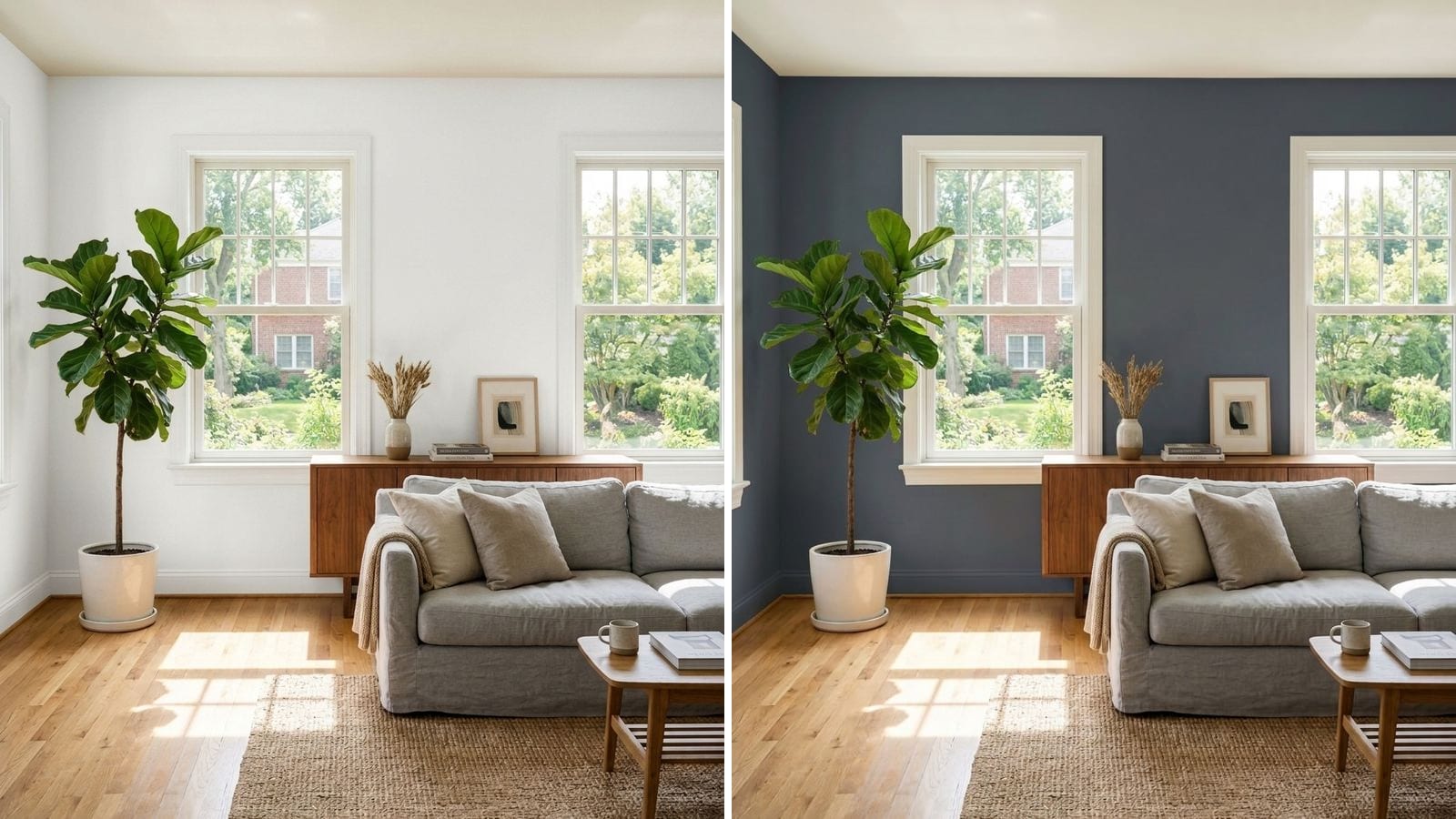
South-facing rooms get strong, warm light for most of the day, so they suit cool and neutral colors best: crisp whites, gray with a hint of blue or green, soft blue-greens and deep navy or charcoal. The sun adds the warmth for you. What usually goes wrong in a south room is a creamy, yellow-based color that the light pushes toward yellow or peach.
This is the opposite of a north-facing room, where you fight cool, flat light with warmth. If you have both in your home, read paint colors for north-facing rooms too. Codes, hex values and LRV below come from the manufacturers' color data in Muro. A hex value is only an approximation on your screen, and a sample on your own wall always has the final say.
How does south light change paint?
In the Northern Hemisphere, a south-facing window sees the sun for most of the day. (In Australia, New Zealand or South Africa, swap north and south.) You'll notice three things on the wall:
- Warm undertones get louder. A white with a little yellow in it can read as cream at noon and as peach in the late afternoon.
- Colors look lighter than the chip. Strong light bounces off the wall, so a mid tone looks paler and a pale tone can wash out.
- The room changes a lot during the day. Bright and fairly neutral around midday, warm and golden as the sun drops. In winter the low sun reaches deeper into the room.
So in a south room you can use colors you would avoid on the north side: cooler whites, grays with blue in them, and dark colors that would look muddy in poor light.
Crisp whites that stay white
A neutral or slightly cool white is the safest base, because in strong sun it stays clean instead of turning creamy. Very bright whites can glare on a wall that takes direct light, so a white with a little gray in it is often more comfortable than the brightest one on the fan deck. More whites are in 12 best white paint colors.
| Brand | Color | Code | Hex | LRV (calc.) |
|---|---|---|---|---|
| Sherwin-Williams | Extra White | SW 7006 | #EEEFEA | 85.9 |
| Sherwin-Williams | Pure White | SW 7005 | #EDECE6 | 83.7 |
| Sherwin-Williams | Snowbound | SW 7004 | #EDEAE5 | 82.5 |
| Farrow & Ball | Wevet | 273 | #EEE9E7 | 82.2 |
Extra White is the crispest and works well on trim and ceilings. Pure White is the easy all-rounder. Snowbound and Wevet have a little more gray in them, so they stay soft even on the wall that takes direct sun. More on reading undertones in white paint undertones explained. These work for whole-house walls, trim and ceilings, and for rooms where one wall takes direct sun.
Cool and neutral grays
Grays that look cold and blue in a north room look balanced in a south one, because the sun takes the chill off. Pick by how much contrast you want with white trim.
| Brand | Color | Code | Hex | LRV (calc.) |
|---|---|---|---|---|
| Benjamin Moore | Stonington Gray | HC-170 | #CACBC5 | 59.3 |
| Sherwin-Williams | Repose Gray | SW 7015 | #CCC9C0 | 58.4 |
| Sherwin-Williams | Light French Gray | SW 0055 | #C2C0BB | 52.8 |
| Benjamin Moore | Coventry Gray | HC-169 | #B8BAB6 | 48.7 |
Stonington Gray is the one the north-facing guide warns about. Its hex is almost perfectly neutral with a hint of green, and on the south side that coolness is what keeps it gray. Repose Gray is the warmest of the four and the safest if your room also has warm wood floors. Coventry Gray, at LRV about 49, is the deepest, and strong light keeps it from feeling heavy. All four are fine in a living room, a home office or a bedroom that gets afternoon sun.
Soft blues and blue-greens
This is where south rooms shine. Cool, airy colors like these can look icy or sickly in north light, and warm sun makes them soft and fresh.
| Brand | Color | Code | Hex | LRV (calc.) |
|---|---|---|---|---|
| Sherwin-Williams | Sea Salt | SW 6204 | #CDD2CA | 63.3 |
| Sherwin-Williams | Rainwashed | SW 6211 | #C2CDC5 | 59.2 |
| Benjamin Moore | Palladian Blue | HC-144 | #C1D1C9 | 61.2 |
| Sherwin-Williams | Upward | SW 6239 | #BFC9D0 | 57.4 |
| Farrow & Ball | Light Blue | 22 | #B8BCB5 | 49.5 |
Sea Salt and Rainwashed lean green, Palladian Blue sits between blue and green, and Upward is the clearest blue. Light Blue by Farrow & Ball is grayer than its name suggests, which makes it a quiet choice for a living room. Blues and blue-greens like these also help a bedroom, bathroom, kitchen or sunroom that feels too hot.
Deep colors: navy, green-gray and charcoal
Dark paint needs light to show its color. In a dim room, navy turns into near-black and dark green turns muddy. A sunny south room shows the blue in the navy and the green in the green-gray. If you have never painted a room dark, start with our guide to moody paint colors.
| Brand | Color | Code | Hex | LRV (calc.) |
|---|---|---|---|---|
| Benjamin Moore | Hale Navy | HC-154 | #434B56 | 6.9 |
| Benjamin Moore | Van Deusen Blue | HC-156 | #485B6E | 10 |
| Farrow & Ball | Hague Blue | 30 | #3D4E57 | 7.1 |
| Sherwin-Williams | Pewter Green | SW 6208 | #5E6259 | 11.8 |
| Benjamin Moore | Kendall Charcoal | HC-166 | #676662 | 13.3 |
Hale Navy is the classic choice and stays navy in strong light. Van Deusen Blue is brighter and bluer. Hague Blue leans toward petrol. Pewter Green and Kendall Charcoal are the softer options if navy feels too formal. Try them in a dining room, a home office, behind a sofa or bed, or in a big bright living room. More navies are in best navy blue paint colors.
How much LRV does a south-facing room need?
Less than you'd think. LRV (light reflectance value) tells you how much light a color sends back, from 0 for black to 100 for white. North rooms need high LRV to feel bright. South rooms already have the light, so the whole range is open:
- LRV 80 and up: clean and bright, but may glare on a wall in direct sun. Fine for ceilings and trim.
- LRV 50 to 70: the comfortable zone for most walls. Color shows without washing out.
- LRV 25 to 50: mid tones look lighter and softer than on the chip. A good place for color.
- Under LRV 15: deep colors that need exactly this kind of light to look rich.
More in how LRV affects your paint choice.
What to avoid in a south-facing room
- Creamy, yellow-based whites on every wall. Under the noon sun they can read as yellow, and in the late afternoon as peach.
- Saturated yellow, orange and terracotta across a whole room. The sun adds its own warmth, and the room can feel hot. Keep these to one wall or an accessory.
- Choosing at noon only. A south room looks most neutral at midday and warmest in the late afternoon. Judge the color at both times.
- Bright white on the wall facing the window. That wall takes the most light. A white with a touch of gray, like Pure White SW 7005, is easier on the eyes.
- Ignoring the floor. Orange-toned oak reflects warm light onto the walls. Next to it, a cool gray stays balanced, but a beige can turn pink.
How to check a color before you buy
- Put the sample on the wall that faces the window and on the wall next to it. In a south room they can look like two different colors.
- Look at it at noon and two hours before sunset. Those are the two extremes of south light.
- Check it again in the evening with your lamps on, because that is how you will see it after dark. More tips in how to test paint colors before committing.
To narrow down the list before you buy sample pots, you can use Muro. Take a photo of your room, pick a real paint by name or code (say Stonington Gray HC-170 or Hale Navy HC-154 from the tables above) and see it on your own walls. In the iPhone app you can switch between day, sunset and night, with lamps on or off, which is the change a south room goes through every day. You can also start in your browser at app.usemuro.com.
Once the color is settled, the paint calculator tells you how much to buy.
FAQ
What color is best for a south-facing room?
Cool and neutral colors. Safe picks are a crisp white like Extra White (SW 7006), a cool gray like Stonington Gray (HC-170) or a soft blue-green like Palladian Blue (HC-144). If you want drama, deep navy like Hale Navy (HC-154) looks its best in south light.
Should I use warm or cool colors in a south-facing room?
Mostly cool or neutral, because the sun already adds warmth. Warm colors can work, but choose muted ones and test them in late-afternoon light, when they look warmest.
Is Agreeable Gray good for a south-facing room?
It can be, but in strong sun it leans more beige. If you want a gray that stays gray, Repose Gray (SW 7015) is a step cooler. See our Agreeable Gray review for the full comparison. Repose Gray and its warmer neighbor are compared in Repose Gray vs Agreeable Gray.
Do dark colors work in south-facing rooms?
Yes, better than in any other orientation. Navy, charcoal and green-gray need light to show their color, and a south room gives it to them. Hale Navy (HC-154) and Pewter Green (SW 6208) are good starting points.
Why does my white look yellow in a south-facing room?
Because the white has a warm, yellow undertone and the sun turns it up. Switch to a neutral or slightly cool white, such as Pure White (SW 7005) or Extra White (SW 7006).
What white is best for a sunny room?
A white with a little gray in it, so it doesn't glare. Pure White (SW 7005) and Snowbound (SW 7004) are softer than the brightest whites but still read as clean white in sun.