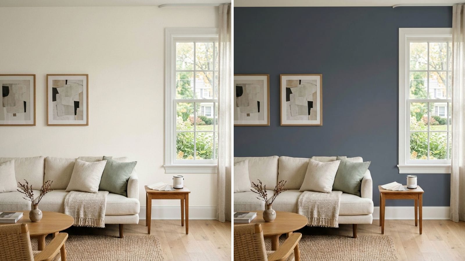
The fastest way to see a paint color in your room before you buy anything is to take a photo of the room and repaint the walls in a visualizer that uses real manufacturer colors. It shows you the color across whole walls, next to your floor and furniture, and lets you compare many colors in minutes. It can't show you the exact paint, so use it to get down to two or three colors, then confirm those with a sample on the wall.
Codes, hex values and LRV in this post come from the manufacturers' color data in Muro. A hex value is only an approximation on your screen, and a sample on your own wall always has the final say.
What a photo of your room can show you
A chip shows you a color; a photo of your room shows how it works with everything else. On a repainted photo you can judge things that no chip or sample can.
The whole wall, not a square. You see how much of the room the color takes up, and whether a dark color makes the room feel smaller or just cozier.
The color next to what stays. Your floor, sofa, cabinets and trim are all in the picture, and that's where most bad choices show up: a greige that looks muddy next to orange oak, a white that looks dirty beside crisper trim.
Many colors in a row. You can look at six or ten candidates on the same wall in the time it takes to paint one sample. You can also try combinations, with walls in one color and an accent wall or trim in another.
What the screen can't show you
The limits are worth knowing, so the photo helps instead of misleading you.
Your screen isn't calibrated to paint. Brightness, display settings and evening night-shift modes all change what you see, and the same photo looks different on a phone and a laptop. Your camera also adjusts the photo, balancing white and exposure on its own, so the picture is already a little off from the room.
Sheen and texture don't come through either. Matte and satin in the same color look different on a real wall, and a photo flattens that. And real light keeps changing: morning, afternoon and evening, clouds and lamps all shift a wall color. A single photo shows one moment, unless the app can show the room at other times of day. The reasons are covered in why paint looks different on the wall than on the chip.
So use a visualizer to narrow the list, not to make the final call. If you're weighing this against physical samples, see peel-and-stick samples vs sample pots vs an app.
How to take a good photo for visualization
The better the photo, the more the result tells you. These make the biggest difference:
- Shoot in daylight. Natural light gives the most neutral starting point.
- Get the whole wall in frame, plus a bit of floor and the furniture next to it. Stand in a corner or a doorway.
- Use the main camera, not the ultra-wide lens. Wide lenses bend straight walls at the edges.
- Hold the phone level and at about chest height, so walls stay upright.
- Turn the flash off and don't aim straight at a bright window. A blown-out window with dark walls gives the app little to work with.
- No filters or portrait mode. You want the room as it really is.
If the room has two very different walls, a sunny one and a shaded one, take two photos.
How to narrow your list to two or three colors
- Start with a direction, not a color. Pick one or two families first: warm white, light greige, a soft green, a navy.
- Put six to ten candidates on the same wall and compare them side by side. Drop anything that clearly fights your floor or furniture.
- Match the temperature of what you can't change. Warm wood and brass want warm colors; gray tile, chrome and marble take cooler ones.
- Look at the survivors in evening light, because that's when you use most rooms. Warm bulbs push whites and greiges toward yellow and beige.
- Keep one close pair and one contrast, say two similar greiges and one darker option, so the sample stage is a real choice.
Which colors are hardest to judge on a chip or a screen?
Whites, light greiges and very dark colors fool people most often. A white hides its undertone until it covers a whole wall, light grays and greiges drift warm or cool with the light, and deep colors look lighter on a chip than on four walls.
| Brand | Color | Code | Hex | LRV (calc.) |
|---|---|---|---|---|
| Sherwin-Williams | Alabaster | SW 7008 | #EDEAE0 | 82.2 |
| Benjamin Moore | Chantilly Lace | 2121-70 | #F4F6F1 | 91.5 |
| Sherwin-Williams | Agreeable Gray | SW 7029 | #D1CBC1 | 60.1 |
| Sherwin-Williams | Repose Gray | SW 7015 | #CCC9C0 | 58.4 |
| Sherwin-Williams | Urbane Bronze | SW 7048 | #54504A | 8.1 |
| Benjamin Moore | Hale Navy | HC-154 | #434B56 | 6.9 |
Alabaster and Chantilly Lace look nearly the same on a chip. On a wall, Alabaster comes out soft and warm and Chantilly Lace crisp and clean. More on that in warm white vs cool white. Agreeable Gray and Repose Gray are another famous pair that only separates on the wall; see the Agreeable Gray review.
What to avoid
- Judging color on a dimmed or night-mode screen. Check the result at normal brightness with the warm evening display mode off.
- Using an inspiration photo instead of your room. A color in someone else's sunlit room says little about yours.
- Picking from one photo at one time of day. Look at the room in evening light too.
- Choosing a color that has no code. If the app shows a nice color without a manufacturer name and code, you can't buy it.
- Skipping the sample. The screen can shorten the list, but only a sample on the wall settles it.
How to check a color before you buy
Muro is made for this step. You take a photo of your room, pick a real paint by name or code from 34 manufacturers plus RAL Classic, for example Alabaster SW 7008 or Hale Navy HC-154, and see it on your own walls with the light and shadows of your photo kept, up to 12 colors side by side. In the iPhone app you can switch the same room between day, sunset and night, with the lamps on or off, and you can also start in your browser at app.usemuro.com. The paint brands' own apps work too if you already know the brand; we compared them in the best paint visualizer apps in 2026.
Once you have two or three finalists, test them with large samples on the wall, as described in how to test paint colors before committing. When the color is settled, the paint calculator tells you how much to buy.
FAQ
Can I see a paint color on my wall before buying it?
Yes. Take a photo of your room and repaint it in a visualizer that uses real manufacturer colors with codes. Use it to narrow the list, then confirm two or three colors with samples on the wall.
Is there an app that shows paint colors on my own walls?
Yes. Paint brands have free apps for their own colors, and multi-brand visualizers show colors from many manufacturers on a photo of your room. Check that every color comes with a manufacturer name and code.
How accurate are paint visualizer apps?
Good enough to compare colors and see how they work with your furniture, not good enough for the final call. Screens, camera settings and sheen all change what you see. Confirm your finalists, for example Repose Gray SW 7015 against Agreeable Gray SW 7029, on the wall.
How do I take a good photo for a paint visualizer?
Shoot in daylight with the main camera, get the whole wall plus some floor and furniture in frame, hold the phone level, and turn off the flash and filters.
Why does paint look different on my screen than on the wall?
Your screen's brightness and settings, your camera's automatic white balance, the paint's sheen and the changing light in the room all play a part. That's why a sample on the wall always has the final say.