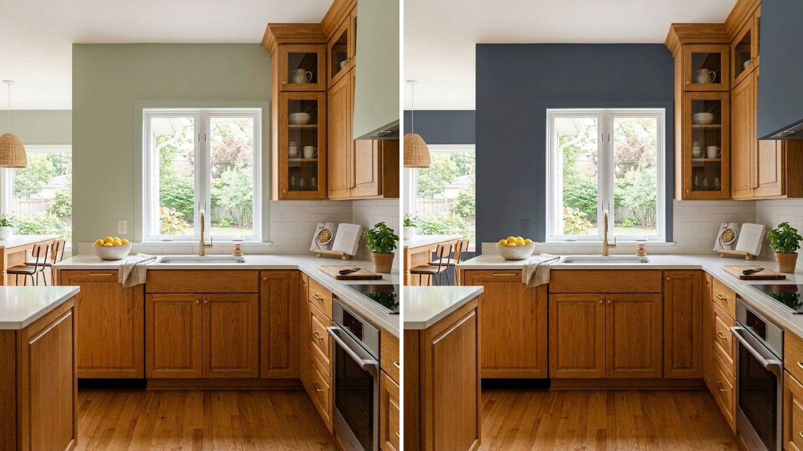
The wall colors that work best with golden or orange oak are the ones that lean slightly green or blue: a greige like Revere Pewter (HC-172), a sage like Saybrook Sage (HC-114) or Evergreen Fog (SW 9130), or a gray-blue like Boothbay Gray (HC-165). They sit opposite orange on the color wheel, so the wood looks warmer and less loud. Beige and yellow walls do the opposite and make oak look even more orange.
Oak from the '80s, '90s and early 2000s rarely looks like raw oak anymore. A lot of it was finished with oil-based polyurethane, which turns slightly amber and gets more so as it cures, according to This Old House. That's where the honey or orange tone comes from. You can't paint the floor, and you may not want to paint the cabinets, so the walls have to do the work. Codes, hex values and LRV below come from the manufacturers' color data in Muro. LRV is calculated from the hex, not taken from the fan deck. A screen is only an approximation, and a sample next to your actual wood decides.
First, figure out what kind of oak you have
Put a sheet of white printer paper on a cabinet door or on the floor and look at the wood next to it.
- Golden or honey oak looks yellow-brown next to paper. It's the easier one. Soft greiges, sage and most warm whites work.
- Orange oak looks almost pumpkin or copper next to paper, sometimes with a pink cast in the grain, which you see more in red oak. This one needs walls with a clear green or blue lean to calm it down.
- Oak with a lot of grain contrast already gives the room plenty of pattern. Flat, quiet colors are a better partner than anything busy.
Then look at the light. In a north-facing room, cool light makes greens and blues look grayer, so pick the warmer versions in each table. A south or west room can take cooler colors, because the sun already pushes everything warm. There's more on this in our guide to north-facing room paint colors.
What to avoid with oak
- Beige, tan and yellow-cream walls. Paint with the same yellow-orange base as the wood makes the oak look more orange, and the room starts to feel like one big brown box. Kilim Beige (SW 6106, #D7C5AE) is a typical example: a nice beige, the wrong one here.
- Stark, bright white. Strong contrast pulls the eye straight to the wood, and next to pure white, honey oak looks yellower than it is.
- Peach, terracotta and pinkish neutrals. They pick up the red in red oak.
- Matching the wood. A brown wall in the same value as the cabinets makes both look dull.
Soft whites that don't fight the wood
If you want a white, go for one with a little warmth and a little gray in it, not a bright one. These four sit at LRV 80 to 90. They make the room bright without turning the oak into the loudest thing in it.
| Brand | Color | Code | Hex | LRV (calc.) |
|---|---|---|---|---|
| Sherwin-Williams | Alabaster | SW 7008 | #EDEAE0 | 82.2 |
| Sherwin-Williams | Pure White | SW 7005 | #EDECE6 | 83.7 |
| Benjamin Moore | Swiss Coffee | OC-45 | #EEECE1 | 83.6 |
| Behr | Whisper White | HDC-MD-08 | #F5F3ED | 89.6 |
Alabaster and Swiss Coffee are the creamier pair and look softer with golden oak. Pure White is a touch cleaner and suits orange oak a bit better, because it adds less yellow of its own. Whisper White is the brightest of the four, so test it next to the wood before you commit. For more options, see our list of the best white paint colors.
Greige with a green lean: the safe middle
This is where most people with oak floors end up. A greige is light enough for a whole house, and the ones below have a little green in them, which is exactly what takes the edge off orange.
| Brand | Color | Code | Hex | LRV (calc.) |
|---|---|---|---|---|
| Benjamin Moore | Edgecomb Gray | HC-173 | #D9D3C4 | 65.3 |
| Sherwin-Williams | Agreeable Gray | SW 7029 | #D1CBC1 | 60.1 |
| Sherwin-Williams | Repose Gray | SW 7015 | #CCC9C0 | 58.4 |
| Benjamin Moore | Revere Pewter | HC-172 | #CBC6B8 | 56.5 |
| Behr | Coliseum Marble | PPU8-16 | #CEC7B8 | 57.4 |
Revere Pewter is the one people usually name first for oak, and for good reason: it's warm enough not to look cold next to wood, and it has the least pink of the classic greiges. If your store only carries Behr, Coliseum Marble is its closest match in Muro's data (ΔE 1.01). Edgecomb Gray is lighter and closer to beige, so keep it for golden oak rather than orange. Repose Gray is the coolest here and the best of the five against very orange wood. There's a full Revere Pewter review if you want to go deeper.
Sage and gray-green: the strongest fix for orange oak
Green is the color that makes oak look intentional instead of dated. A muted sage next to honey wood reads as a calm, slightly old-fashioned kitchen in the good sense. The darker greens work on a single wall or in a room with lots of light.
| Brand | Color | Code | Hex | LRV (calc.) |
|---|---|---|---|---|
| Behr | Whitened Sage | PPU10-12 | #DEE0D3 | 73.5 |
| Benjamin Moore | Saybrook Sage | HC-114 | #B1B7A2 | 45.8 |
| Sherwin-Williams | Clary Sage | SW 6178 | #ACAD97 | 40.9 |
| Sherwin-Williams | Evergreen Fog | SW 9130 | #95978A | 30.4 |
| Sherwin-Williams | Pewter Green | SW 6208 | #5E6259 | 11.8 |
Whitened Sage is barely green, more of a pale green-gray, and it's the one to try if you'd like a light room. Saybrook Sage and Clary Sage are the classic mid sages; Clary Sage has a bit more yellow, so it's friendlier to golden oak, while Saybrook Sage is cooler and handles orange oak better. Evergreen Fog is darker and grayer. Its closest Behr twin is Hunters Hollow (MQ6-21, ΔE 0.89). Pewter Green is deep enough for an island wall or a dining room. Our green paint colors guide has more greens if none of these feels right.
Blue-gray and navy: contrast that cools the wood
Blue is directly opposite orange, so it's the strongest correction of all. A pale gray-blue keeps the room light. Navy is for when you want the oak to look rich, like furniture, instead of something you're putting up with.
| Brand | Color | Code | Hex | LRV (calc.) |
|---|---|---|---|---|
| Sherwin-Williams | Upward | SW 6239 | #BFC9D0 | 57.4 |
| Benjamin Moore | Boothbay Gray | HC-165 | #AAB2B0 | 43.5 |
| Benjamin Moore | Van Deusen Blue | HC-156 | #485B6E | 10.0 |
| Benjamin Moore | Hale Navy | HC-154 | #434B56 | 6.9 |
| Behr | Starless Night | PPU14-20 | #3E4855 | 6.3 |
Boothbay Gray is the easiest place to start: it looks gray in a dim room and blue in a bright one, and either way it settles orange wood down. Upward is lighter and more clearly blue, which suits a south-facing room. Hale Navy and Van Deusen Blue are the dark options. Behr Starless Night is ΔE 1.54 from Hale Navy, close enough to stand in for it. If you're choosing between navies, read Hale Navy vs Naval first.
Cabinets, floors, or both?
The advice above holds for both, with one difference. Cabinets sit at eye level, right next to the wall, so the wall color touches them directly and the contrast matters more. A floor is further from the wall and usually broken up by rugs and furniture, so the wall has less to answer to.
When you have oak cabinets and an oak floor in the same room, and they don't quite match (very common), pick the wall color for the cabinets. If you're thinking about painting the cabinets instead, our kitchen cabinet paint colors list covers that route.
How to check a color before you buy
- Tape the sample right against the wood. A swatch on a wall across the room tells you nothing about how it looks next to the cabinets.
- Check it at three times of day. Morning light, afternoon sun and warm bulbs at night all change how orange the oak looks, and the wall changes with it.
- Compare two directions at once, say a greige and a sage. Oak makes the differences obvious fast.
So you don't buy six sample pots, you can narrow the list in Muro first. Take a photo of your own kitchen or living room, pick a real paint by name or code, for example from the tables above, and see it on your walls next to your actual oak. In the iPhone app you can switch between day, sunset and night, with lamps on or off. You can also start in your browser at app.usemuro.com. Once you've decided, the paint calculator tells you how much to buy.
FAQ
What color walls go with honey oak cabinets?
Greige with a slight green lean and soft sage work best. Revere Pewter (HC-172), Agreeable Gray (SW 7029) and Clary Sage (SW 6178) are good starting points. Skip yellow-beige, which makes the oak look more orange.
What paint color tones down orange oak?
Colors opposite orange on the color wheel: green-grays and blue-grays. Saybrook Sage (HC-114), Evergreen Fog (SW 9130) and Boothbay Gray (HC-165) all calm orange wood. For a darker option, Hale Navy (HC-154).
Is gray or white better with oak floors?
A warm gray or greige is usually safer. A bright white makes the floor look more yellow by contrast, and a cool gray with no warmth can look cold next to wood. If you want white, choose a soft one like Alabaster (SW 7008).
Does Agreeable Gray go with oak?
Yes, especially with golden oak. With very orange oak, Repose Gray (SW 7015) is a better pick because it's a bit cooler.
What color should you not paint with oak cabinets?
Avoid beige and tan in the same yellow-orange family as the wood, peach and terracotta, and very bright white. All three make the oak look more orange.