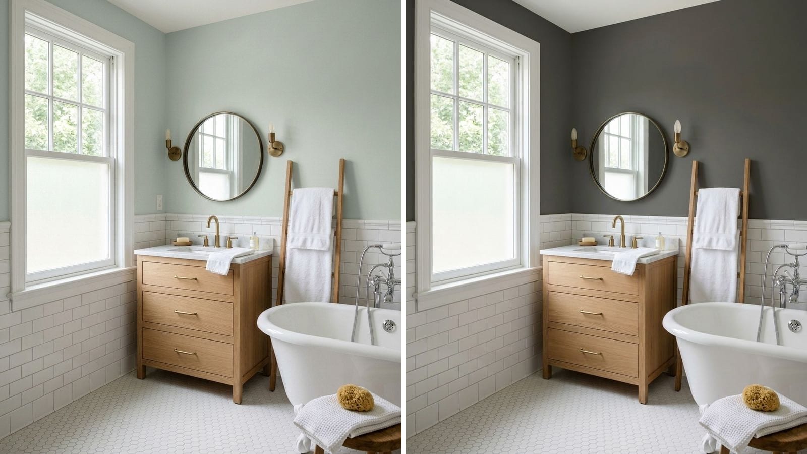
The best bathroom paint colors are soft whites like Sherwin-Williams Alabaster (SW 7008), gray blue-greens like Rainwashed (SW 6211), pale blues like Upward (SW 6239) and warm neutrals like Agreeable Gray (SW 7029). If you want more character, Benjamin Moore Saybrook Sage (HC-114) or a near-black like Iron Ore (SW 7069) works well in a powder room. Which one is right depends mostly on the tile and fixtures you're keeping.
Codes, hex values and LRV come from the manufacturers' color data in Muro. A hex on your screen is an approximation, so a sample on your own wall has the final say. This guide is about color for a regular bathroom with some daylight. If yours has no window, read paint colors for a small bathroom without a window. If you're worried about mildew, finish and formula are covered in do you need mold-resistant bathroom paint.
Start with what you're not replacing
In a kitchen the paint has a lot of company. In a bathroom it shares the room with a few big, hard surfaces you probably won't change: tile, tub, vanity, countertop. The paint has to get along with them.
- Pure white tile and a white tub. Almost anything works. Very creamy whites are the one thing to be careful with, because next to bright white porcelain they can look a little yellow.
- Beige, cream or travertine-look tile. Skip cool whites and icy blues, which make warm tile look dirty. Warm neutrals and sage are safer.
- Gray or marble-look tile. Check the veining. Blue-gray veins point to blues and blue-greens. Warm gray veins point to greige.
- Metal finish. Chrome and polished nickel look natural with cool colors. Brass and gold look better with warm neutrals, sage and dark greens.
Hold the paint chip against the tile itself, not against the old wall. Then look at the light. A north-facing bathroom gets cooler light, so blues and grays read colder there (more in paint colors for north-facing rooms). A south-facing one can take cooler colors more easily.
1. Soft whites for white tile and chrome
White walls make a bathroom look clean and bright and they never fight the tile. The question is how warm. Extra White is on the cool, crisp side, close to plain white porcelain. Alabaster and Wimborne White have more warmth and feel softer with wood or brass. More options are in 12 best white paint colors.
| Brand | Color | Code | Hex | LRV |
|---|---|---|---|---|
| Sherwin-Williams | Extra White | SW 7006 | #EEEFEA | 85.9 |
| Sherwin-Williams | Alabaster | SW 7008 | #EDEAE0 | 82.2 |
| Farrow & Ball | Wimborne White | 239 | #F7F3E8 | 89.7 |
| Farrow & Ball | All White | 2005 | #FBF8F4 | 94.2 |
LRV values calculated from hex.
2. Gray blue-greens: the spa look
This is the classic bathroom family and it has earned it. A soft green with plenty of gray in it looks calm, goes with white fixtures and both chrome and nickel, and doesn't go cold the way a clear pastel blue can. Rainwashed is the lightest and greenest of these. Wythe Blue is deeper, with more blue in it, and suits a larger primary bathroom.
| Brand | Color | Code | Hex | LRV |
|---|---|---|---|---|
| Sherwin-Williams | Rainwashed | SW 6211 | #C2CDC5 | 59.2 |
| Sherwin-Williams | Comfort Gray | SW 6205 | #BEC3BB | 53.6 |
| Benjamin Moore | Wythe Blue | HC-143 | #AABEB4 | 48.7 |
| Behr | Whitened Sage | PPU10-12 | #DEE0D3 | 73.5 |
LRV values calculated from hex.
3. Pale blues and blue-grays
Blue is the other obvious bathroom color, but bright sky blue can look dated quickly. The versions that still feel current are grayed down. Upward is light and airy. Krypton and Boothbay Gray have more gray in them and look calmer, especially with marble-look tile with gray veining. Lulworth Blue is the clearest blue in the group, for a room where you actually want people to notice the color.
| Brand | Color | Code | Hex | LRV |
|---|---|---|---|---|
| Sherwin-Williams | Upward | SW 6239 | #BFC9D0 | 57.4 |
| Sherwin-Williams | Krypton | SW 6247 | #B8C0C3 | 51.8 |
| Benjamin Moore | Boothbay Gray | HC-165 | #AAB2B0 | 43.5 |
| Farrow & Ball | Lulworth Blue | 89 | #A1B8CA | 46.1 |
LRV values calculated from hex.
In a north-facing bathroom, sample these next to a warm neutral before you decide. Cool light plus a cool color can feel chilly on a winter morning.
4. Warm neutrals for beige and travertine tile
Plenty of bathrooms still have beige, cream or travertine-look tile that nobody plans to rip out. Painting the walls bright white or blue next to it usually makes the tile look older. A warm greige or tan blends the tile in instead of highlighting it. Agreeable Gray and Revere Pewter are the safe picks. Manchester Tan is warmer and a bit more yellow, and Sculptor Clay sits between them. More in best greige paint colors.
| Brand | Color | Code | Hex | LRV |
|---|---|---|---|---|
| Sherwin-Williams | Agreeable Gray | SW 7029 | #D1CBC1 | 60.1 |
| Benjamin Moore | Revere Pewter | HC-172 | #CBC6B8 | 56.5 |
| Benjamin Moore | Manchester Tan | HC-81 | #DBD2BC | 64.8 |
| Behr | Sculptor Clay | PPU5-08 | #CCC3B6 | 55.2 |
LRV values calculated from hex.
5. Sage and deeper greens
Sage and muted green sit well with wood, brass and white tile, and they bring color in without shouting. Saybrook Sage is a mid-tone sage you can use on all four walls. Evergreen Fog is deeper and grayer. Card Room Green and Pewter Green are dark enough to feel moody, so use them in a bathroom with decent light or on the lower half of the wall below a white upper section.
| Brand | Color | Code | Hex | LRV |
|---|---|---|---|---|
| Benjamin Moore | Saybrook Sage | HC-114 | #B1B7A2 | 45.8 |
| Sherwin-Williams | Evergreen Fog | SW 9130 | #95978A | 30.4 |
| Farrow & Ball | Card Room Green | 79 | #899081 | 26.8 |
| Sherwin-Williams | Pewter Green | SW 6208 | #5E6259 | 11.8 |
LRV values calculated from hex.
6. Charcoal, black and navy for a powder room
A powder room is the best place in the house to try a dark color. It's small, you don't spend long in it, and there's usually no shower steam to deal with. A near-black like Iron Ore or Tricorn Black with a white sink and a good mirror light looks deliberate. Newburyport Blue is a softer option if black feels like too much.
| Brand | Color | Code | Hex | LRV |
|---|---|---|---|---|
| Sherwin-Williams | Iron Ore | SW 7069 | #434341 | 5.6 |
| Sherwin-Williams | Tricorn Black | SW 6258 | #2F2F30 | 2.9 |
| Benjamin Moore | Newburyport Blue | HC-155 | #465566 | 8.8 |
| Farrow & Ball | Railings | 31 | #45484B | 6.4 |
LRV values calculated from hex.
An LRV under 10 means the walls send back very little of your light, so plan for a brighter fixture. If you've never painted a room this dark, read the beginner's guide to moody paint colors first.
What to avoid
- Picking the color in the paint store. Store lighting is nothing like your bathroom. Look at the sample at home, next to the tile, in the morning and in the evening.
- Fighting the tile. Cool white next to beige tile, or a warm cream next to cold gray tile, makes one of them look wrong. Match the undertone.
- Bright, saturated pastels. Sky blue, mint and pink in full strength tend to look dated fast. Choose the grayed versions above.
- Dark paint with one weak ceiling light. A dark bathroom needs a proper light at the mirror, or it just feels dim.
- Flat or matte paint near the shower. It holds moisture and marks easily. See our mold-resistant bathroom paint guide for which finish to use.
How to check a color before you buy
Paint two or three large samples on the wall right next to the tile or the vanity, not on the opposite wall. Look at them with the lights you actually use at the mirror, and again in daylight if the room has a window.
To cut the list down before buying samples, you can try the colors in Muro. Take a photo of your bathroom, pick a real paint by name or code (the tables above are a good shortlist), and see it on your own walls next to your own tile and fixtures. In the iPhone app you can switch between day, sunset and night and turn the lamps on or off. You can also start in your browser at app.usemuro.com.
If a color is from a brand your store doesn't carry, paint color twins across brands explains how close matches from other brands get. The paint calculator tells you how much paint the room needs.
FAQ
What is the most popular bathroom paint color?
Soft whites, gray blue-greens and warm neutrals are the usual picks. Sherwin-Williams Alabaster (SW 7008), Rainwashed (SW 6211) and Agreeable Gray (SW 7029) are safe starting points.
What color makes a bathroom look clean?
A soft white like Sherwin-Williams Extra White (SW 7006) next to white tile, or a very pale gray-green like Behr Whitened Sage (PPU10-12). Both keep the room bright without feeling clinical.
What paint color goes with beige bathroom tile?
A warm neutral like Benjamin Moore Revere Pewter (HC-172) or Manchester Tan (HC-81). Avoid cool whites and icy blues, which make beige tile look dirty.
Is gray still a good bathroom color?
Warm grays and greiges like Agreeable Gray (SW 7029) still work well. Cool, flat grays look dated in many bathrooms. A gray with green or blue in it, like Boothbay Gray (HC-165), feels fresher.
Can you paint a bathroom a dark color?
Yes, especially a powder room. Iron Ore (SW 7069) or Newburyport Blue (HC-155) look intentional with white fixtures and a bright mirror light.
What color is good for a bathroom with no window?
Warm whites, soft greige or a deliberate dark color, chosen under your own bulbs. We go through it in paint colors for a small bathroom without a window.