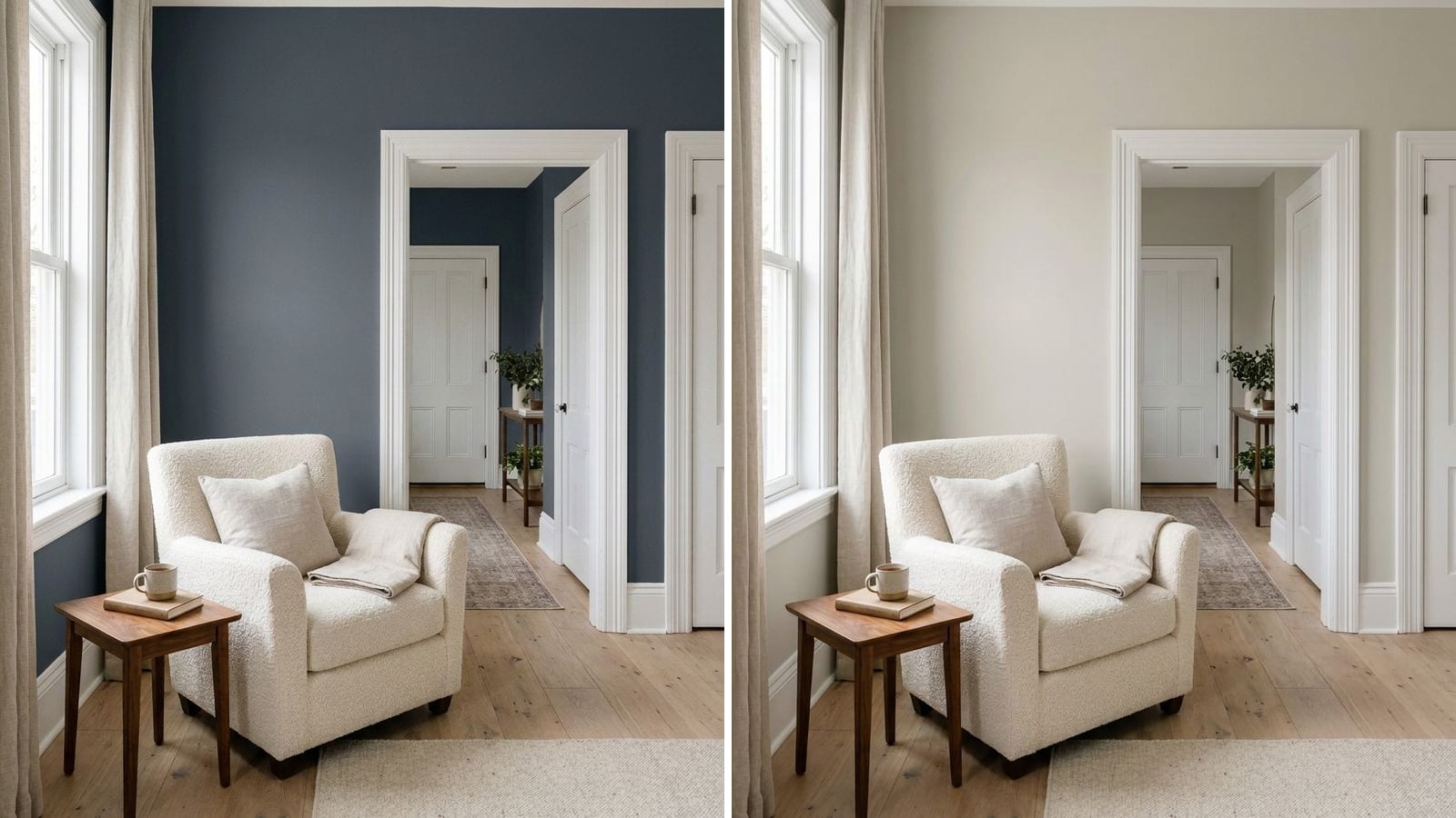
For most homes, paint trim in a white that is a little cleaner and brighter than the walls, in satin or semi-gloss. Match the white's lean to the wall: soft, warm whites like Alabaster SW 7008 or Swiss Coffee OC-45 next to beige and greige, cleaner, more neutral whites like Extra White SW 7006 or Chantilly Lace next to cool grays and dark blues. Trim in the same color as the walls also works, as long as the trim gets a higher sheen.
Below: which whites work on trim and why, which white goes with which wall color, which finish to use, and when it makes sense to skip white altogether. Names, codes and hex values come from the manufacturers' color data in Muro. A hex value on a screen is only an approximation, so test a sample next to your real trim before you buy.
Which white is best for trim?
There is no single best white. It depends on your walls. What separates trim whites is how much warmth they carry and how bright they are. The table shows popular trim whites with their lean, read from the hex value: the more the red value (first pair of digits) exceeds the blue value (last pair), the warmer the white. More whites are in 12 best white paint colors.
| Brand | Color | Code | Hex | LRV (calc.) | Lean |
|---|---|---|---|---|---|
| Sherwin-Williams | High Reflective White | SW 7757 | #F7F7F1 | 92.6 | Brightest, neutral |
| Benjamin Moore | Chantilly Lace | 2121-70 | #F4F6F1 | 91.5 | Clean, neutral |
| Benjamin Moore | Simply White | 2143-70 | #F6F6ED | 91.6 | Clean, a touch warm |
| Sherwin-Williams | Extra White | SW 7006 | #EEEFEA | 85.9 | Neutral |
| Benjamin Moore | Decorator's White | CC-20 | #EBEDEA | 84.2 | Neutral to cool |
| Sherwin-Williams | Pure White | SW 7005 | #EDECE6 | 83.7 | Neutral, slightly soft |
| Benjamin Moore | Swiss Coffee | OC-45 | #EEECE1 | 83.6 | Warm, creamy |
| Sherwin-Williams | Alabaster | SW 7008 | #EDEAE0 | 82.2 | Warm, soft |
The LRV here is calculated from the hex value, not the number the manufacturer prints. The higher it is, the brighter the white.
If you shop at another store, these whites have close twins: Pure White SW 7005 is a near match for PPG Commercial White (1025-1, ΔE 0) and Valspar Snowed In (6004-1A, ΔE 0.43). Alabaster SW 7008 is close to Behr Salt Crystal (QE-25, ΔE 0.61). Chantilly Lace is close to Behr Snow Fall (W-F-600, ΔE 0.41).
For a deeper look at how whites differ, see white paint undertones explained and warm white vs cool white. Three popular warm whites are compared side by side in Alabaster vs White Dove vs Chantilly Lace.
Which trim white goes with which wall color?
A simple rule: the trim white should lean the same way as the wall. A warm greige with a stark, cool white next to it can look dirty. A cool gray with a creamy white next to it can make the trim look yellowed. These pairs follow that rule, based on the hex values:
| Wall color | Code | Hex | Trim white | Code |
|---|---|---|---|---|
| Sherwin-Williams Agreeable Gray | SW 7029 | #D1CBC1 | Alabaster or Pure White | SW 7008 / SW 7005 |
| Benjamin Moore Revere Pewter | HC-172 | #CBC6B8 | Swiss Coffee | OC-45 |
| Sherwin-Williams Repose Gray | SW 7015 | #CCC9C0 | Pure White or Extra White | SW 7005 / SW 7006 |
| Sherwin-Williams Sea Salt | SW 6204 | #CDD2CA | Extra White | SW 7006 |
| Benjamin Moore Hale Navy | HC-154 | #434B56 | Chantilly Lace | 2121-70 |
Two practical notes. With light walls, pick a trim white that is clearly brighter, or the trim looks like a slightly dirty version of the wall. With dark walls, almost any clean white works, but a very bright white makes the contrast sharp. A softer white such as Pure White SW 7005 calms it down.
If you are curious how Agreeable Gray behaves in different light, our Agreeable Gray review covers it in detail.
Satin, semi-gloss or gloss for trim?
Use satin or semi-gloss for most trim. Both clean up well and both stand out a little against flat or eggshell walls.
- Satin looks softer and hides small dents and brush marks better. Benjamin Moore recommends it to "highlight windows, shutters, trim and even interior doors."
- Semi-gloss is the classic trim finish. Benjamin Moore calls it "perfectly suited to highlight the architectural details" on millwork, trim and doors. It wipes clean easily, which helps on baseboards that get kicked and mopped.
- Gloss looks sharp and lacquered but shows every flaw. Benjamin Moore's advice is to avoid it on surfaces that are not completely smooth.
Paint type matters as much as sheen. Traditional oil-based enamels give a hard, smooth finish but are known to yellow with age. Water-based trim enamels aim to keep the look without that: Sherwin-Williams, for example, describes its Emerald Urethane Trim Enamel as a waterborne urethane-modified alkyd that "resists yellowing compared to traditional oil based paints," sold in satin, semi-gloss and gloss.
For how sheen works across the whole house, see our paint finish guide.
That covers baseboards, door and window casings, crown molding and interior doors.
Should trim be the same color as the walls?
It can be, and it often looks calm and modern. Painting the trim in the wall color hides uneven or plain trim, makes small rooms feel less chopped up and lets art and furniture stand out. Taken all the way, with the ceiling too, it's called color drenching.
The one rule: change the sheen. Walls in matte or eggshell, trim in satin or semi-gloss, same color. The trim still reads as trim.
Same-color trim works best:
- In mid-tone and dark colors. A whole room in Hale Navy HC-154, trim included, looks deliberate. Trim in white would cut it into pieces.
- In small rooms and hallways, where many doors and frames would otherwise break up the walls.
- With simple, flat trim. Detailed traditional moldings often look better picked out in white.
It works less well in rooms with lots of white elements you can't paint, such as white windows, white doors or white built-ins. Then a white trim ties everything together.
Dark trim: black, charcoal, bronze
Dark trim frames a room the way black window frames frame a view. It suits white or very light walls and modern or farmhouse interiors. Keep it to one element at first, such as interior doors or window casings, before you paint every baseboard.
| Brand | Color | Code | Hex | LRV (calc.) |
|---|---|---|---|---|
| Sherwin-Williams | Tricorn Black | SW 6258 | #2F2F30 | 2.9 |
| Sherwin-Williams | Iron Ore | SW 7069 | #434341 | 5.6 |
| Sherwin-Williams | Urbane Bronze | SW 7048 | #54504A | 8.1 |
| Benjamin Moore | Hale Navy | HC-154 | #434B56 | 6.9 |
Iron Ore and Urbane Bronze are softer than pure black and forgive dust and scuffs better on baseboards. Urbane Bronze has a near twin at Benjamin Moore: Dragon's Breath (1547, ΔE 0.65).
Dark trim does its best work on interior doors, window casings and stair railings, against white or pale walls. The same idea outdoors is covered in white house with black trim.
What to avoid when choosing trim paint
- A white that leans the other way from the walls. Cool white next to warm greige looks dirty. Creamy white next to cool gray looks yellowed.
- Trim almost the same as a light wall. If the wall is off-white, the trim needs to be clearly brighter or exactly the same, not something in between.
- Wall paint on trim. Flat or eggshell wall paint scuffs and stains easily on baseboards and doors. Use a trim enamel in satin or semi-gloss.
- Gloss on old, dented trim. It shows every flaw. Satin is kinder.
- Choosing the trim white from a chip alone. A white chip on a white store shelf tells you nothing. Hold it against your wall color and your floor.
- Mixing whites in one open space. Pick one trim white for all connected rooms, so doors and baseboards match where rooms meet.
How to check a color before you buy
- Paint the trim white sample right next to the wall color, not on its own. A trim white only makes sense next to the wall.
- Check it next to things you can't change: white windows, a white tub, kitchen cabinets. The trim should match them or clearly not.
- Look at it in daylight and at night. Warm bulbs make creamy whites look more yellow.
To compare a few whites and wall colors together before buying samples, you can try them in Muro. You take a photo of your own room, choose real paints by name or code, for example Agreeable Gray SW 7029 on the walls, and see how they look in your space. In the iPhone app you can check the room by day, at sunset and at night, with lamps on or off. You can also start in your browser at app.usemuro.com. For the amount of trim paint, the paint calculator helps you avoid buying too much.
FAQ
What is the most popular white for trim?
Clean, neutral whites are the usual choice, such as Pure White SW 7005, Extra White SW 7006 or Chantilly Lace by Benjamin Moore (2121-70). With warm walls, a softer white like Alabaster SW 7008 often looks better.
Should trim be lighter or darker than the walls?
Usually lighter: a brighter white trim frames the walls. Darker trim, such as Tricorn Black SW 6258, works as a deliberate contrast against white or very light walls.
Is satin or semi-gloss better for trim?
Both work. Semi-gloss is easier to wipe clean and is the classic choice. Satin looks softer and hides small dents and brush marks better.
Should trim and ceiling be the same white?
It is a simple, safe choice, but the finish should differ: flat on the ceiling, satin or semi-gloss on the trim. If your walls are warm, use a warm white such as Alabaster SW 7008 for both.
Can you paint trim the same color as the walls?
Yes. Use the same color in a higher sheen on the trim, for example Hale Navy HC-154 in matte on the walls and in semi-gloss on the trim. It suits small rooms, simple trim and darker colors.
What white trim goes with Agreeable Gray?
A soft, slightly warm white such as Alabaster SW 7008 or Pure White SW 7005. Stark, cool whites can make Agreeable Gray look dull next to them.