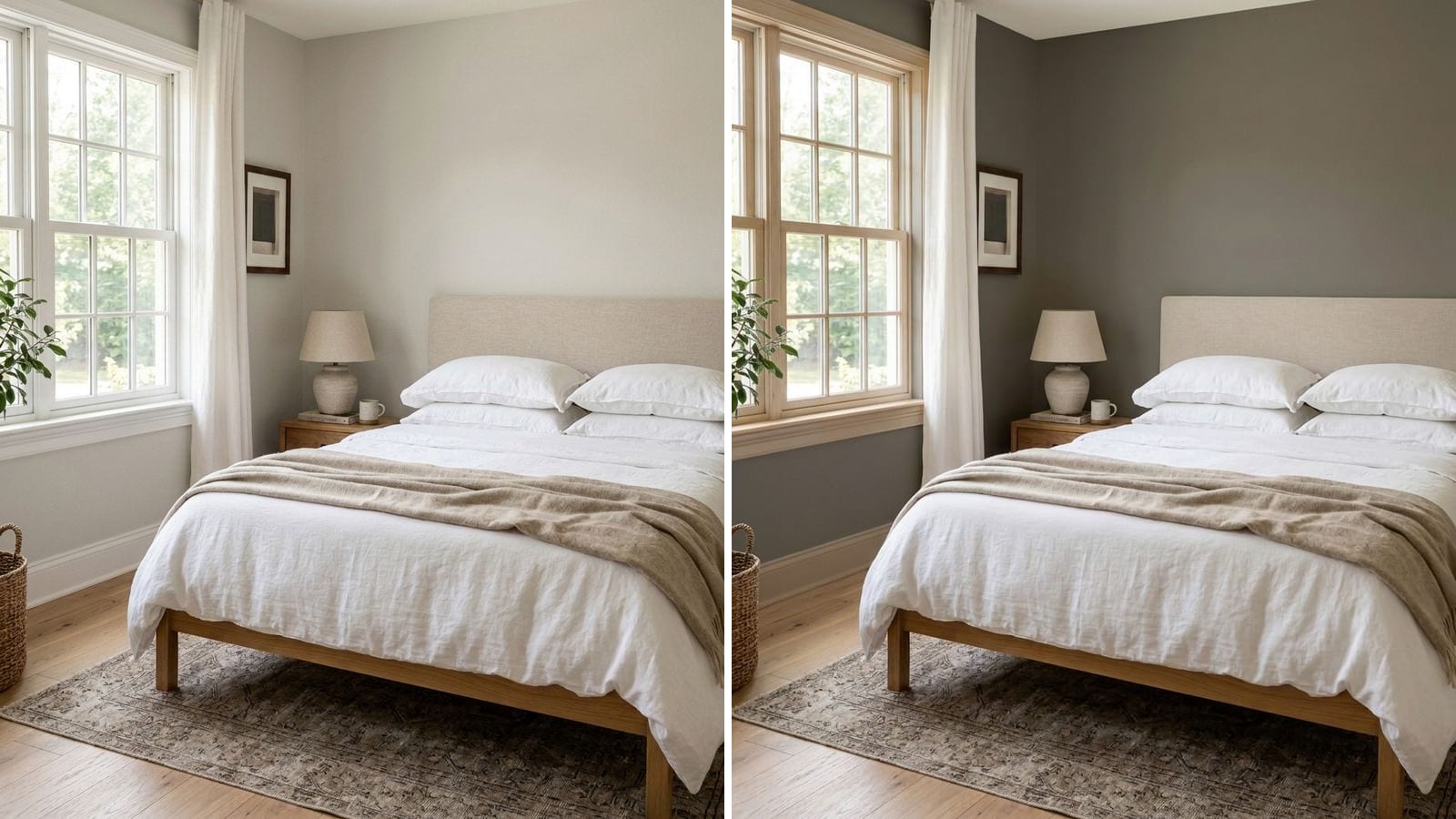
Pick Repose Gray (SW 7015) if you want a light gray that stays gray, especially with cool finishes like gray tile, white marble or chrome. Pick Agreeable Gray (SW 7029) if you want a warmer greige that leans toward beige, especially with wood floors, cream fabrics and warm bulbs. Agreeable Gray is a touch lighter (LRV 60 vs 58), and the two are so close that you shouldn't use them in rooms that open onto each other.
Codes, hex values and LRV come from the manufacturers' color data in Muro, except where we quote Sherwin-Williams directly. A hex value is only an approximation on your screen, and a sample on your own wall always has the final say. For everything about Agreeable Gray on its own, see our Agreeable Gray review. This post is only about the choice between the two.
Repose Gray vs Agreeable Gray at a glance
| Repose Gray | Agreeable Gray | |
|---|---|---|
| Code | SW 7015 | SW 7029 |
| Hex | #CCC9C0 | #D1CBC1 |
| RGB | 204 / 201 / 192 | 209 / 203 / 193 |
| LRV (Sherwin-Williams) | 58 | 60 |
| Reads as | Light gray with a soft warm base | Light greige, gray with beige |
| Gap between red and blue | 12 | 16 |
LRV figures are from Sherwin-Williams' color pages: Repose Gray lists 58.22 and Agreeable Gray lists 60.386.
How different are they, really?
Measured with CIEDE2000, the standard formula for how different two colors look, the gap between Repose Gray and Agreeable Gray is ΔE 1.58. Under 1 is practically identical; around 1.5 is a difference you see when the two colors touch, and mostly miss when they're in separate rooms.
The difference has two parts:
- Lightness. Agreeable Gray reflects about two percentage points more light. On a wall that's a small step.
- Temperature. Both are warm-based, but Agreeable Gray has more red and yellow in it. Repose Gray sits closer to true neutral, with the faintest lean toward green-gray in some light. That's why Repose reads "gray" and Agreeable reads "greige".
Pick one and later wish you'd picked the other, and the room still won't look wrong. It'll just be a bit cooler or a bit warmer than you imagined.
Which one in a north-facing room?
North light is cool and indirect. Every light gray comes out cooler and flatter in it.
- Agreeable Gray keeps more of its warmth, so in a north room it usually reads as a soft, neutral gray.
- Repose Gray in the same room can look noticeably cooler, closer to a plain mid gray on a cloudy day.
If you want the room to feel warm, Agreeable Gray is the safer pick. If you like a cool gray and the room gets decent light, Repose is fine. More on light direction in north-facing room paint colors.
Which one in a south- or west-facing room?
Warm, direct sun pushes warm grays toward beige.
- Agreeable Gray in strong afternoon sun can look clearly beige or tan.
- Repose Gray has less beige to push, so it stays gray longer.
If you want gray rather than beige in a sunny room, choose Repose Gray.
Which one with your floors and finishes?
The floor and counters you can't change matter more than the wall color's own undertone, so match their temperature.
| Your room has | Better match | Why |
|---|---|---|
| Honey or red oak, warm wood cabinets | Agreeable Gray | Shares the warm base, looks intentional |
| Cream sofa, linen, brass, warm bulbs | Agreeable Gray | Stays in the same warm family |
| Gray tile, gray vinyl plank, concrete | Repose Gray | A warm greige next to cool gray can look muddy |
| White marble, chrome, black metal | Repose Gray | Keeps the cleaner, cooler look |
| Mixed: white oak, white trim, mostly neutral | Either | Decide by your light (see above) |
Always test the sample right next to the floor. Orange-toned wood can make any light gray look a little green by contrast. If you're going for one color through the whole house, pick one of the two and stay with it.
Lighter and darker versions of each
Both colors sit on Sherwin-Williams strips with lighter and darker neighbors. If one is right but too light or too heavy for your room, move along its own strip instead of switching color families. If you want something darker and more khaki, Revere Pewter has its own review of Revere Pewter.
| Brand | Color | Code | Hex | LRV (calc.) |
|---|---|---|---|---|
| Sherwin-Williams | Eider White | SW 7014 | #E2DED8 | 73.4 |
| Sherwin-Williams | Repose Gray | SW 7015 | #CCC9C0 | 58.4 |
| Sherwin-Williams | Mindful Gray | SW 7016 | #BCB7AD | 47.6 |
| Sherwin-Williams | Dorian Gray | SW 7017 | #ACA79E | 38.9 |
| Sherwin-Williams | Incredible White | SW 7028 | #E3DED7 | 73.5 |
| Sherwin-Williams | Agreeable Gray | SW 7029 | #D1CBC1 | 60.1 |
| Sherwin-Williams | Anew Gray | SW 7030 | #BFB6AA | 47.4 |
If Repose Gray feels too pale in a big, bright room, Mindful Gray is the next step down. Anew Gray is the same step for Agreeable Gray. For a dim room, go up the strip to Eider White or Incredible White. More light-to-deep options in this family are in best greige paint colors.
Which trim whites and dark accents go with each?
| Brand | Color | Code | Hex | LRV (calc.) | Best with |
|---|---|---|---|---|---|
| Sherwin-Williams | Extra White | SW 7006 | #EEEFEA | 85.9 | Repose Gray |
| Sherwin-Williams | Pure White | SW 7005 | #EDECE6 | 83.7 | Both |
| Sherwin-Williams | Alabaster | SW 7008 | #EDEAE0 | 82.2 | Agreeable Gray |
| Sherwin-Williams | Naval | SW 6244 | #2F3D4C | 4.5 | Repose Gray |
| Sherwin-Williams | Iron Ore | SW 7069 | #434341 | 5.6 | Both |
| Sherwin-Williams | Urbane Bronze | SW 7048 | #54504A | 8.1 | Agreeable Gray |
Pure White is the safe choice for trim with either one. Extra White is crisper and suits the cooler Repose Gray, while Alabaster is creamier and looks better next to Agreeable Gray.
Twins in other brands
If your store sells another brand, these are their twins in other brands in Muro's database. ΔE under 1 is practically identical, under 2 very close.
| Brand | Color | Code | Hex | Twin of | ΔE |
|---|---|---|---|---|---|
| PPG Paints | Swirling Smoke | 1007-2 | #CECAC1 | Repose Gray | 0.60 |
| Benjamin Moore | Apparition | 860 | #CCC8BE | Repose Gray | 0.62 |
| Valspar | Notre Dame | 5006-1B | #C9C9C3 | Repose Gray | 1.81 |
| PPG Paints | Whiskers | 1025-3 | #D1CCC2 | Agreeable Gray | 0.55 |
| Benjamin Moore | Collingwood | 859 | #D3CEC4 | Agreeable Gray | 0.85 |
| Behr | Mineral | UL170-15 | #D7D0C6 | Agreeable Gray | 1.35 |
Benjamin Moore's Apparition (860) and Collingwood (859) sit next to each other in its numbering and mirror the Repose and Agreeable pair almost exactly. A twin matches the color, not the paint: sheen and coverage still depend on the product. See paint color twins across brands for how these matches work. If you're choosing between brands, see Sherwin-Williams vs Benjamin Moore.
What to avoid
- Using both in connected rooms. At ΔE 1.6, side by side, they look like you couldn't make up your mind.
- Deciding from the chips. On 2-inch chips they look almost identical. You only see the difference on a large patch.
- Testing only at noon. Warm evening bulbs push both toward beige, Agreeable Gray more so.
- Ignoring fixed finishes. The floor and countertops decide more than the undertone.
- Choosing Repose Gray to "fix" a dark room. It's the darker of the two. Go to Eider White or Incredible White instead.
How to check a color before you buy
- Put both samples side by side on the wall where you spend most time, then on the darkest wall.
- Hold them next to your floor and trim. That's where the warm or cool difference shows.
- Look in the evening with your lamps on. That's when Agreeable Gray goes most beige. Honestly, don't decide before you've seen it at night.
To see both on your whole room first, you can use Muro. You take a photo of your room, pick a real paint by name or code, for example Repose Gray SW 7015 and Agreeable Gray SW 7029, and see them on your own walls side by side. In the iPhone app you can switch between day, sunset and night, with the lamps on or off. You can also start in your browser at app.usemuro.com. Then get samples of the winner and confirm on the wall.
Once the color is settled, the paint calculator tells you how much to buy.
FAQ
Is Repose Gray lighter or darker than Agreeable Gray?
Slightly darker. Sherwin-Williams lists Repose Gray SW 7015 at LRV 58 and Agreeable Gray SW 7029 at LRV 60.
Is Repose Gray warmer or cooler than Agreeable Gray?
Cooler. Both have a warm base, but Repose Gray reads as a light gray while Agreeable Gray reads as a greige with more beige.
Which is better for a north-facing room, Repose Gray or Agreeable Gray?
Usually Agreeable Gray. Cool north light flattens light grays, and Agreeable Gray's extra warmth keeps it from looking cold.
Does Repose Gray look green or purple?
In most rooms it reads as a soft neutral gray. In some cool or green-tinted light it can lean slightly green-gray. Test it next to your floor and in evening light.
Can I use Repose Gray and Agreeable Gray together?
Not in rooms you can see from one another; they are close enough to look like a mismatch. Pair either one with a white like Pure White SW 7005 and a dark accent like Iron Ore SW 7069 instead.
What is the Benjamin Moore equivalent of Repose Gray?
Apparition (860), ΔE 0.62, practically identical in Muro's data. For Agreeable Gray it's Collingwood (859), ΔE 0.85.