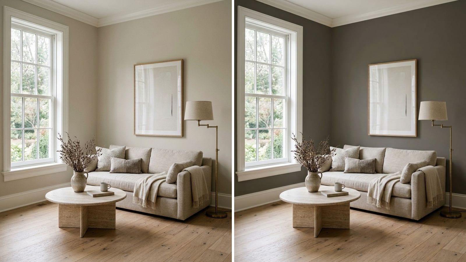
The best greige paint colors for most homes are Agreeable Gray (SW 7029), Revere Pewter (HC-172) and Accessible Beige (SW 7036), which sit in the middle at LRV 56 to 60. For a lighter room, go to Edgecomb Gray (HC-173) or Pale Oak (OC-20); for more depth, Perfect Greige (SW 6073) or Mega Greige (SW 7031).
Greige is gray and beige mixed: warmer than a true gray, calmer than a true beige. That's why it works with wood floors, white trim and most furniture. The catch is that every greige leans a little somewhere, toward green, toward pink or toward yellow, and that lean shows up on four walls. Below are 14 greiges sorted by lightness, with the direction each one leans. Codes, hex values and LRV come from the manufacturers' color data in Muro. The LRV is calculated from the hex, not taken from the paint can. A screen is only an approximation, so a sample on your wall decides.
How to tell which way a greige leans
You can't read undertone from a name. "Gray" in the name doesn't make it cool, and "beige" doesn't make it yellow. Three quick tests:
- Hold the chip against white printer paper. A greige that looks faintly green, pink or yellow next to paper will look more so on a wall.
- Compare two greiges side by side. Undertone is relative. Revere Pewter looks warm next to Repose Gray and almost cool next to Accessible Beige.
- Look at it in your light. North light pulls greige cooler and grayer; south and west light warm it up. See our guide to north-facing room paint colors.
In the tables below, the "Leans" column comes from the hex values themselves. The differences are subtle, and your light can push any of them one way or the other.
Light greige: LRV 65 to 70
These read as an off-white with a little body. They're the safest choice for small rooms, dim rooms and whole-house color, because they keep the space bright while still looking warmer than white.
| Brand | Color | Code | Hex | LRV (calc.) | Leans |
|---|---|---|---|---|---|
| Benjamin Moore | Pale Oak | OC-20 | #DDD9CE | 69.5 | neutral |
| Sherwin-Williams | Drift of Mist | SW 9166 | #DCD8D0 | 68.9 | neutral |
| Benjamin Moore | Balboa Mist | 1549 | #DAD6CC | 67.4 | neutral |
| Benjamin Moore | Edgecomb Gray | HC-173 | #D9D3C4 | 65.3 | warm |
Edgecomb Gray is the warmest of the four and the closest to beige. Pale Oak and Balboa Mist are nearly twins: ΔE between Balboa Mist and Behr Ginger Sugar (MQ3-18) is only 0.23, and Pale Oak and Ginger Sugar are 0.63 apart.
Classic greige: LRV 55 to 60
This is the middle of the road and where most people end up. Light enough for a living room, and the walls still don't look unfinished. The two most popular picks are compared in Repose Gray vs Agreeable Gray.
| Brand | Color | Code | Hex | LRV (calc.) | Leans |
|---|---|---|---|---|---|
| Sherwin-Williams | Agreeable Gray | SW 7029 | #D1CBC1 | 60.1 | balanced, slightly warm |
| Sherwin-Williams | Accessible Beige | SW 7036 | #D1C7B8 | 57.9 | warm, beige side |
| Sherwin-Williams | Worldly Gray | SW 7043 | #CEC6BB | 57.1 | warm |
| Benjamin Moore | Revere Pewter | HC-172 | #CBC6B8 | 56.5 | warm, least pink |
| Behr | Sculptor Clay | PPU5-08 | #CCC3B6 | 55.2 | warm |
How to choose between them:
- Agreeable Gray is the most balanced. If you can't decide, start here. We reviewed it in detail in the Agreeable Gray review.
- Accessible Beige has the most color of the five. Good with warm wood and cream fabrics, less so next to cool gray tile.
- Revere Pewter is a little darker and has the least pink in it of the five, so it reads earthier. It goes well with white trim and brass.
- Worldly Gray and Sculptor Clay are close to each other (ΔE 1.14) and sit a step darker than Agreeable Gray and Accessible Beige, with similar warmth.
Deeper greige: LRV 37 to 45
Darker greiges make a room feel snugger. They work on every wall of a bright room, or on a single wall in a bedroom or an office. In a dim room, test carefully: with little light, a deep greige can look muddy. Revere Pewter, the best known of them, has a full review of Revere Pewter.
| Brand | Color | Code | Hex | LRV (calc.) | Leans |
|---|---|---|---|---|---|
| Benjamin Moore | Pashmina | AF-100 | #BBB2A1 | 45.0 | warm, slightly yellow |
| Behr | Perfect Taupe | PPU18-13 | #B5ACA1 | 41.9 | warm, slight pink |
| Sherwin-Williams | Perfect Greige | SW 6073 | #B7AB9F | 41.7 | warm, slight pink |
| Benjamin Moore | Grége Avenue | 991 | #B7A99C | 40.8 | warm, pink-taupe |
| Sherwin-Williams | Mega Greige | SW 7031 | #ADA295 | 36.9 | warm |
Perfect Greige, Perfect Taupe and Grége Avenue are close enough to swap: Perfect Taupe is ΔE 1.38 from Perfect Greige. Pashmina is the one that leans slightly yellow rather than pink.
Same greige, another brand
If your store doesn't carry the brand you picked, these are close matches. ΔE measures the distance between two colors: the lower, the closer.
| Color | Twin | Code | ΔE |
|---|---|---|---|
| Agreeable Gray SW 7029 | Benjamin Moore Collingwood | 859 | 0.85 |
| Revere Pewter HC-172 | Behr Coliseum Marble | PPU8-16 | 1.01 |
| Accessible Beige SW 7036 | Behr Shoreline Haze | MQ6-31 | 0.5 |
| Edgecomb Gray HC-173 | Behr Stonewashed | PPU8-15 | 0.8 |
| Perfect Greige SW 6073 | Benjamin Moore Evening Gown | CSP-375 | 0.57 |
| Mega Greige SW 7031 | Benjamin Moore Quicksand | CSP-200 | 0.74 |
For more pairs, see paint color twins across brands.
What to pair with greige
Greige needs a clear partner for trim and a darker color for contrast, or the whole room goes flat. Which white and which finish to use is covered in the trim paint color guide.
| Role | Brand | Color | Code | Hex |
|---|---|---|---|---|
| Trim, creamy | Sherwin-Williams | Alabaster | SW 7008 | #EDEAE0 |
| Trim, clean | Sherwin-Williams | Pure White | SW 7005 | #EDECE6 |
| Contrast, warm | Sherwin-Williams | Urbane Bronze | SW 7048 | #54504A |
| Contrast, cool | Benjamin Moore | Hale Navy | HC-154 | #434B56 |
Use the creamy white with warm greiges (Accessible Beige, Pashmina) and the cleaner white with balanced ones (Agreeable Gray, Pale Oak). Urbane Bronze works on doors, cabinets or an island; Hale Navy suits greiges with no pink in them, like Revere Pewter. Our guide to white paint undertones goes deeper on trim.
What to avoid with greige
- Choosing by name. Agreeable Gray and Accessible Beige are both greige. Names say little about undertone.
- A stark, bluish white trim next to a warm greige. The greige can look dingy or yellowed against it.
- A greige the same value as your floor or cabinets. Everything blends. Go clearly lighter or clearly darker.
- A deep greige in a dark room. Perfect Greige or Mega Greige in a north-facing room with one window can read muddy. Go lighter and test.
- Testing a tiny sample on a white wall. A small patch surrounded by white looks different from a fully painted room. Check how LRV affects your paint choice.
How to check a color before you buy
- Pick two or three greiges with different leans, for example Agreeable Gray, Revere Pewter and Accessible Beige.
- Paint large samples on two walls: one that gets direct light and one that doesn't.
- Look morning, afternoon and evening with lamps on. The lean you saw at noon may be gone by evening.
To avoid buying ten sample pots, narrow it down in Muro first. Take a photo of your room, pick real paints by name or code, for example from the tables above, and see them on your own walls next to your own floor and furniture. In the iPhone app you can see the room by day, at sunset and at night, with lamps on or off. You can also start in your browser at app.usemuro.com. Once you've chosen, the paint calculator tells you how much to buy.
FAQ
What is the best greige paint color?
For most rooms, Agreeable Gray (SW 7029). It's the most balanced of the classic greiges, at LRV 60.1 (calculated). If you want more warmth, Accessible Beige (SW 7036); slightly darker and with the least pink, Revere Pewter (HC-172).
What is the best light greige paint?
Pale Oak (OC-20) and Edgecomb Gray (HC-173) from Benjamin Moore. Pale Oak is the more neutral of the two; Edgecomb Gray is warmer and closer to beige.
Is Agreeable Gray a greige?
Yes. Despite the name, Agreeable Gray (SW 7029, #D1CBC1) is a light greige: a gray with enough beige in it to look warm on the wall.
What is the difference between greige and taupe?
Greige is gray plus beige and stays fairly light and neutral. Taupe is darker and browner, often with a pink or purple tint. Perfect Greige (SW 6073) and Grége Avenue (991) sit on the border between the two.
What greige works in a north-facing room?
A warmer, lighter one, such as Accessible Beige (SW 7036) or Edgecomb Gray (HC-173). North light makes greige look cooler, so the warmth helps it stay soft.
What white trim goes with greige?
A creamy white such as Alabaster (SW 7008) with warm greiges, and a cleaner white such as Pure White (SW 7005) with balanced ones like Agreeable Gray.