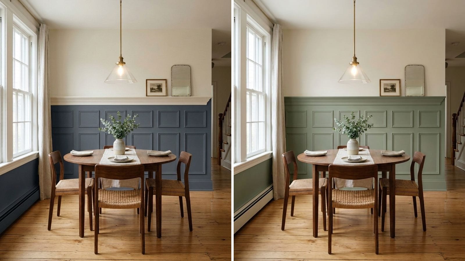
For two-tone walls, put the darker color below the chair rail and a light color above, and keep a clear gap in lightness between them. Hale Navy (HC-154) under Swiss Coffee (OC-45), Pewter Green (SW 6208) under Sea Salt (SW 6204) and Tricorn Black (SW 6258) under Accessible Beige (SW 7036) are easy pairs to start with. If you'd rather keep the paneling white, go the other way: white wainscoting with a sage, clay or gray-green wall above.
Below are 15 pairs in five directions. Codes, hex values and LRV come from the manufacturers' color data in Muro. LRV here is calculated from the hex value, not quoted by the manufacturer. A screen only approximates paint, so put a sample on the wall before you buy gallons.
Which color goes on the bottom?
Most of the time, the darker one. The lower wall is what chairs, vacuums and shoes hit, so a deeper color hides scuffs, and a light upper wall keeps the room bright.
The reverse works too, mostly with white wainscoting or board and batten. Then the paneling reads like tall trim and the color above does the talking.
Height matters as much as color. Metrie, a molding maker, puts the usual chair rail height at about a third of the wall, which is around 32 inches in a room with 8-foot ceilings. The same article says the rail itself can sit anywhere from 24 to 72 inches, so taller paneling, up to shoulder height, is fine in a mudroom or bathroom.
How much contrast do you want?
LRV runs from 0 for black to 100 for white. The gap between your two numbers tells you how strong the split will look:
- A gap of 50 or more gives a crisp, graphic line. Navy or black under a warm white sits here.
- A gap of roughly 25 to 40 looks clearly two-tone but calm. Gray-green under a light greige is typical.
- A gap under 15 is subtle. On paneling the shadows carry it; on flat drywall with only a chair rail it can disappear.
That's our rule of thumb, not an industry standard. More in our LRV guide.
1. Navy below, warm white above
The most traditional pair, and hard to get wrong in a dining room, hallway or bathroom. Pick a warm white for the upper wall; a stark, bluish white next to navy looks cold.
| Part | Brand | Color | Code | Hex | LRV (calc.) |
|---|---|---|---|---|---|
| Lower | Benjamin Moore | Hale Navy | HC-154 | #434B56 | 6.9 |
| Upper | Benjamin Moore | Swiss Coffee | OC-45 | #EEECE1 | 83.6 |
| Lower | Sherwin-Williams | Naval | SW 6244 | #2F3D4C | 4.5 |
| Upper | Sherwin-Williams | Alabaster | SW 7008 | #EDEAE0 | 82.2 |
| Lower | Benjamin Moore | Newburyport Blue | HC-155 | #465566 | 8.8 |
| Upper | Benjamin Moore | Pale Oak | OC-20 | #DDD9CE | 69.5 |
Naval is the darkest of the three and goes almost black in the evening. Newburyport Blue is a little lighter and bluer, and with Pale Oak above it the contrast drops, which suits a room that gets less light. If you're torn between the first two, we compared them in Hale Navy vs Naval.
2. Deep green below, soft light above
Green is the usual alternative to navy. It sits well with wood floors, brass and plants, and feels less formal.
| Part | Brand | Color | Code | Hex | LRV (calc.) |
|---|---|---|---|---|---|
| Lower | Sherwin-Williams | Pewter Green | SW 6208 | #5E6259 | 11.8 |
| Upper | Sherwin-Williams | Sea Salt | SW 6204 | #CDD2CA | 63.3 |
| Lower | Behr | Dark Everglade | HDC-CL-21A | #3D554F | 8.1 |
| Upper | Behr | Whisper White | HDC-MD-08 | #F5F3ED | 89.6 |
| Lower | Sherwin-Williams | Rosemary | SW 6187 | #64695C | 13.6 |
| Upper | Sherwin-Williams | Greek Villa | SW 7551 | #F0ECE2 | 84 |
Pewter Green and Sea Salt both carry a gray-green undertone, so the pair looks related rather than stacked. Dark Everglade has more blue-teal in it and reads moodier. Rosemary is the warmest and most olive of the three.
3. Same family, two depths
If you want two tones but not a hard line, take two colors from the same family, one a few steps darker. It's the safest choice in open-plan spaces.
| Part | Brand | Color | Code | Hex | LRV (calc.) |
|---|---|---|---|---|---|
| Lower | Sherwin-Williams | Comfort Gray | SW 6205 | #BEC3BB | 53.6 |
| Upper | Sherwin-Williams | Sea Salt | SW 6204 | #CDD2CA | 63.3 |
| Lower | Sherwin-Williams | Dovetail | SW 7018 | #908A83 | 25.7 |
| Upper | Sherwin-Williams | Agreeable Gray | SW 7029 | #D1CBC1 | 60.1 |
| Lower | Behr | Fashion Gray | PPU18-15 | #A29C95 | 33.6 |
| Upper | Behr | Burnished Clay | PPU18-09 | #D2CCC5 | 60.9 |
Comfort Gray under Sea Salt has a gap of only about 10 LRV points. That's enough on real paneling, where shadows draw the lines. On a flat wall with just a chair rail, go for something like Dovetail under Agreeable Gray.
4. White wainscoting, color above
Here the paneling stays white and the color goes on top. It suits rooms where trim and doors are already one white, and small, dark rooms where a heavy lower band would feel cramped.
| Part | Brand | Color | Code | Hex | LRV (calc.) |
|---|---|---|---|---|---|
| Lower | Sherwin-Williams | Extra White | SW 7006 | #EEEFEA | 85.9 |
| Upper | Sherwin-Williams | Evergreen Fog | SW 9130 | #95978A | 30.4 |
| Lower | Benjamin Moore | Swiss Coffee | OC-45 | #EEECE1 | 83.6 |
| Upper | Benjamin Moore | Saybrook Sage | HC-114 | #B1B7A2 | 45.8 |
| Lower | Sherwin-Williams | Pure White | SW 7005 | #EDECE6 | 83.7 |
| Upper | Sherwin-Williams | Cavern Clay | SW 7701 | #AC6B53 | 19.9 |
Use the same white on the wainscoting as on the rest of your trim. Two slightly different whites in one room look like an error up close. Our trim paint guide helps pick that one white.
5. Black or charcoal below, warm beige above
The strongest contrast here. It works in rooms with good light and in spaces you pass through, like an entry or a powder room. A warm beige above softens it more than a white would.
| Part | Brand | Color | Code | Hex | LRV (calc.) |
|---|---|---|---|---|---|
| Lower | Sherwin-Williams | Tricorn Black | SW 6258 | #2F2F30 | 2.9 |
| Upper | Sherwin-Williams | Accessible Beige | SW 7036 | #D1C7B8 | 57.9 |
| Lower | Sherwin-Williams | Urbane Bronze | SW 7048 | #54504A | 8.1 |
| Upper | Sherwin-Williams | Kilim Beige | SW 6106 | #D7C5AE | 57.4 |
| Lower | Behr | Cracked Pepper | PPU18-01 | #4F5152 | 8.2 |
| Upper | Behr | Creamy Mushroom | PPU5-13 | #CABDAF | 52 |
Urbane Bronze is a brown-leaning charcoal, softer than true black, and with Kilim Beige the whole wall stays warm. Cracked Pepper is a neutral soft black from Behr's Premium Plus line, sold at Home Depot.
What color should the chair rail be?
You have two good options:
- Paint the chair rail the lower color. The wainscoting reads as one block. It looks more modern and is easier to paint cleanly.
- Paint the chair rail in your trim white. You get a thin white stripe between the colors, which looks more traditional.
Don't give it a third color. On the lower part use satin or semi-gloss, which wipes clean; the upper wall can stay matte or eggshell. Our paint finish guide explains the trade-offs.
What to avoid with two-tone walls
- Splitting the wall in half. Either keep the lower part at about a third of the wall, or go clearly taller.
- Two colors with the same lightness. A muted green and a dusty pink with similar LRV look muddy together. Check the numbers first.
- A light color below and a dark one above on plain drywall. Without paneling it can make the ceiling feel lower and the room top-heavy.
- Clashing undertones. A cool blue-gray below a yellow-cream above often looks off. Stay in one temperature, or let one of the two be close to neutral.
- Testing each color on its own. Paint both on one board, with the line at the real height.
How to check a color before you buy
A pair is harder to judge than a single color, because what matters is how the two look together at full size. Paint two big samples, one above the other, on poster board and move it around the room during the day. Look again in the evening with the lamps on.
You can also try pairs on your own room in Muro before buying samples. You take a photo of the room, choose real paints by name or code, for example Hale Navy for the lower wall and Swiss Coffee for the upper wall, and see them on your own walls. In the iPhone app you can switch between day, sunset and night, with the lamps on or off. In a browser, start at app.usemuro.com. Once you've picked the pair, the paint calculator tells you how much of each color to buy.
FAQ
Should the darker color be on the top or bottom of a two-tone wall?
Usually on the bottom. A dark lower wall hides scuffs and keeps the room feeling grounded. The exception is white wainscoting or board and batten with a colored wall above, such as Extra White (SW 7006) under Evergreen Fog (SW 9130).
What color goes with navy wainscoting?
A warm white or soft off-white above. Swiss Coffee (OC-45) over Hale Navy (HC-154), or Alabaster (SW 7008) over Naval (SW 6244), both work well. Avoid bright, bluish whites.
How high should wainscoting be on a two-tone wall?
About a third of the wall height is the usual choice, roughly 32 inches with 8-foot ceilings. Taller paneling, up to shoulder height, works in mudrooms and bathrooms. Avoid splitting the wall exactly in half.
Should the chair rail match the wainscoting or the trim?
Either works. Painted in the lower color, it looks more modern and the wainscoting reads as one block. Painted in your trim white, it looks more traditional. Don't give it a third color.
What sheen should wainscoting be?
Satin or semi-gloss on the lower part, because it gets touched and bumped. The upper wall can stay matte or eggshell.