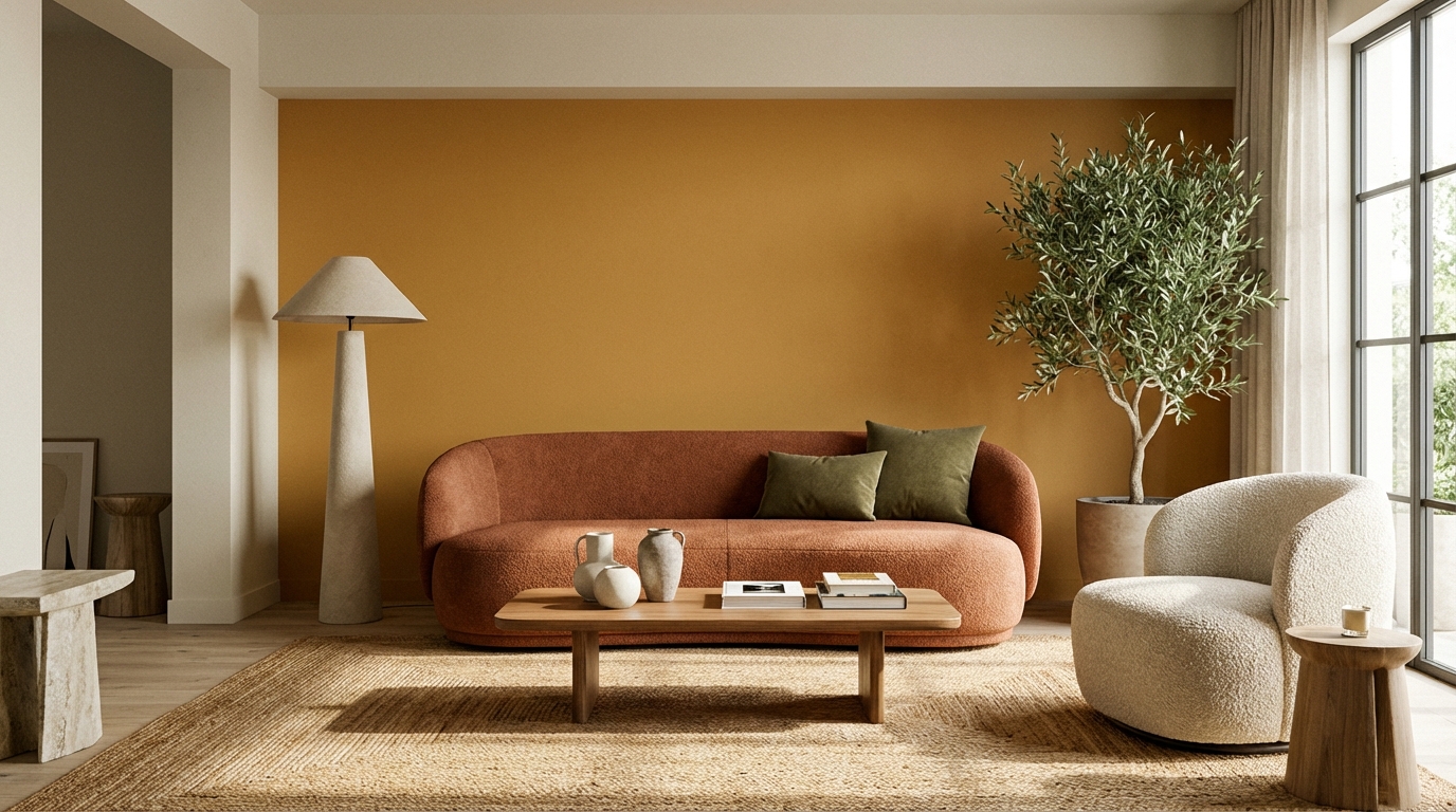
The short version: warm is in, cool is out. Earthy terracottas, forest greens, warm neutrals, and saturated blues are dominating. Cool gray—the color that defined the 2010s—is officially dead.
Paint trends cycle every few years, but this shift feels different. People are actively rejecting the sterile, Instagram-minimalist aesthetic that made everyone's home look like a dentist's office.
Let's break down what's actually happening.
The colors of the year (and what they tell us)
Every major paint brand announced their 2025-2026 color, and the pattern is unmistakable:
| Brand | 2025 Color | LRV | What It Is |
|---|---|---|---|
| Sherwin-Williams | Quietude SW 6212 | 56 | Muted sage green |
| Benjamin Moore | Cinnamon Slate 2113-40 | 27 | Warm earthy brown |
| Behr | Rumors N110-4 | 36 | Terracotta-toned neutral |
| PPG | Limitless | 42 | Warm cognac brown |
| Farrow & Ball | Ointment | 64 | Soft peachy neutral |
Notice anything? Not a single cool gray. Not a single stark white. Not even a navy blue. The industry is collectively saying: "We're done with cold."
Trend 1: Terracotta took over
When terracotta started showing up everywhere in 2023, plenty of people wrote it off as a flash trend—too specific, too tied to a boho-Southwest aesthetic. That take hasn't aged well.
Terracotta moved from accent color to main event. Entire living rooms are now painted in warm clay tones that would have seemed insane five years ago. And they look incredible.
Why it works: Terracotta makes a room feel grounded without feeling heavy. It's warm but not aggressive. It photographs well but looks even better in person. It pairs with natural wood, black metal, white trim—basically everything.
Best uses:
- Full living rooms (yes, really)
- Dining rooms (creates intimacy)
- Home offices (energizing without anxiety)
- Kitchens with light wood cabinets
Colors worth trying:
- Cavern Clay SW 7701 (LRV 23) — the OG
- Potters Clay 1221 Benjamin Moore (LRV 19)
- Terracotta Tile Behr S180-6 (LRV 21)
It also works better than you'd expect in north-facing rooms—a look that can feel questionable on a paint chip comes together once the furniture is in.
Trend 2: Green went dark
Sage green had its moment. Soft, approachable, safe. Everyone and their grandmother painted something sage in 2022-2024.
Now green is growing up. Forest green. Hunter green. Almost-black-but-still-green green.
Home offices are a common place to try it. A deep forest green like Hunt Club (SW 6468, LRV 4) can trigger doubt in the first week—"this is too dark, this was a mistake"—and still end up as a favorite room a few months later, once the eye adjusts and the lighting is dialed in. The cocooning effect suits a room built for focus.
Why it works: Deep green creates drama without pretension. It's grown-up but not cold. It pairs well with brass, warm wood, cream accents, and even pink.
Best uses:
- Home offices and libraries
- Bedrooms seeking calm
- Dining rooms for intimate dinners
- Powder rooms making a statement
Colors worth trying:
- Hunt Club SW 6468 (LRV 4)
- Backwoods 469 Benjamin Moore (LRV 4)
- Vine Green PPG1028-7 (LRV 6)
Warning: These colors are LOW LRV. Like, really low. You need good lighting—natural or artificial—or they'll feel oppressive. Warm LED strips above shelves or behind furniture make a real difference.
Trend 3: Cool gray is dead
Here's an unpopular opinion: cool gray was always kind of overrated.
Don't get me wrong—I understand why it happened. The 2010s were about "clean" and "modern" and "minimalist." Cool grays with blue undertones looked fantastic in professionally photographed real estate listings.
But to live with? In real lighting? With actual furniture? Cool gray often reads as sad. Sterile. Hospital-waiting-room. Walk into enough homes painted Repose Gray or similar and the reaction is often the same: nothing. Or worse, slightly depressed.
What's replacing gray:
- Greige (gray-beige blends)
- Warm taupes
- Mushroom tones
- Warm whites
Colors worth trying:
- Shiitake SW 9173 (LRV 39) — neutral but alive
- Stone Hearth 984 Benjamin Moore (LRV 28)
- Moth Gray Behr N200-4 (LRV 43)
If you currently have cool gray walls and something feels "off" about your space, try painting one room a warm neutral. The difference is immediately obvious.
Trend 4: Saturated blues are back
Navy never went away, but it got company. We're seeing deeper, more saturated blues—not quite primary blue, but bolder than safe navy.
Why it works: Saturated blue is bold without feeling trendy. Unlike teal (which can feel dated quickly) or powder blue (which can feel juvenile), a deep saturated blue reads as confident.
Best uses:
- Front doors (instant curb appeal)
- Kitchen islands and lower cabinets
- Bedroom accent walls
- Home exteriors
Colors worth trying:
- Endless Sea SW 9150 (LRV 14)
- Champion Cobalt 2061-20 Benjamin Moore (LRV 10)
- Starless Night Behr S530-7 (LRV 7)
Saturated blue front doors are showing up everywhere, and they look fantastic against almost any exterior—white siding, brick, gray stone.
Trend 5: White got warmer
White walls aren't going anywhere. But which white matters more than ever.
The stark, blue-undertone whites of minimalism are fading. In their place: creamy, soft, warm-leaning whites. Whites with a hint of yellow or pink. Whites that feel like natural light, not fluorescent light.
What's in:
- Whites with yellow undertones
- Whites with pink undertones
- Off-whites that read as "natural"
What's out:
- Stark pure white
- Whites with blue undertones
- Anything that feels "clinical"
Colors worth trying:
- White Flour SW 7102 (LRV 83)
- Navajo White OC-95 Benjamin Moore (LRV 78)
- Cameo White Behr 730C-1 (LRV 84)
The difference between a warm white and a cool white is subtle on a paint chip. On four walls, it's the difference between "cozy and inviting" and "is this a hospital?"
Trend 6: Black as a main color
Here's a bold one: black walls are happening. Not just as an accent. Full rooms. Sometimes full houses.
Media rooms are where it works best: a color like Tricorn Black (LRV 3) in a modern matte finish that doesn't reflect light weirdly, paired with warm-toned furniture and lots of texture, can feel like a high-end hotel lounge instead of a cave.
Best uses:
- Media rooms and home theaters
- Dramatic dining rooms
- Modern bathrooms
- Statement ceilings (a matte black ceiling in a small room works better than it sounds)
Colors worth trying:
- Tricorn Black SW 6258 (LRV 3)
- Black Panther 2125-10 Benjamin Moore (LRV 3)
- Black Mocha Behr N120-7 (LRV 4)
Important: Black only works with intention. You need warm lighting, contrasting textures (wood, brass, linen), and enough natural light to prevent feeling claustrophobic.
What's officially out
Let me save you from a regrettable decision:
- Millennial pink — Had its moment (2018-2020). Now reads as dated.
- Cool grays — The Agreeable Gray era is over.
- Stark white — Warm white is the move now.
- Light sage — Still pretty, but deepening to forest green.
- Blush tones — Giving way to terracotta.
- Olive green — Replaced by true greens.
How to use trends without regret
The right approach to trends: respect them, don't chase them.
Big surfaces = timeless. Your main living areas should be colors you'll love in five years. Warm whites, warm neutrals, greiges. These form a backdrop that works with any accent.
Small surfaces = trendy. Want to try terracotta? Paint one accent wall. Or your front door. Or a single piece of furniture. Easy to change later.
Test before committing. Trending colors often look different in Pinterest photos than in your actual room. That terracotta looks amazing in a sunny southwest-facing room. In your north-facing bedroom? Maybe not. Use Muro to preview colors in your actual space before buying paint.
Consider your lighting. Warm trends (terracotta, warm whites) look best in warm lighting. If your home has cool-toned LED bulbs, either change them or adjust your color expectations.
Regional reality check
Trends play differently depending on where you live:
Northern climates: Lean hard into warm colors. Terracotta and warm neutrals counteract gray winters.
Southern climates: You can get away with cooler colors since sunlight provides natural warmth.
Coastal areas: Blues work naturally. Terracotta might feel disconnected from your environment.
Urban apartments: Moody colors (deep green, black) can work well even with less natural light if you have good artificial lighting.
So what should you actually paint?
The 2025-2026 story is simple: warmth won.
Warm neutrals beat cool grays. Warm whites beat stark whites. Earth tones beat sterile minimalism. Nature-inspired colors beat everything.
If you're repainting soon, consider:
- Terracotta for warmth and drama
- Forest green for depth and elegance
- Warm white for safe versatility
- Saturated blue for statement pieces
But here's the real trend advice: if a trending color doesn't work in your space or with your stuff, skip it. The best color for your home is the one you love living with—not the one that's on magazine covers.
Trends cycle every 5-10 years anyway. Pick what feels right to you.