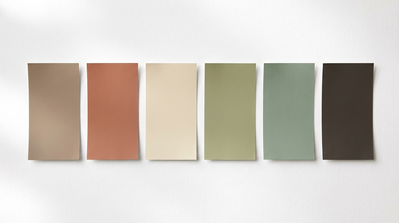
There are twelve different "Colors of the Year" for 2026. Twelve. Every major paint brand picked their own, and honestly—they couldn't disagree more. One went with a smoky jade. Another picked an off-white. A third chose deep plum. It's a mess, and if you're trying to figure out which one to actually put on your walls, you're probably more confused than when you started.
Here's the honest breakdown, based on their LRV numbers, undertones, and how they tend to behave on real walls.
The Full 2026 Color of the Year Lineup
Let's lay them all out. Because seeing them together tells a story:
| Brand | Color Name | Type | LRV | Vibe |
|---|---|---|---|---|
| Benjamin Moore | Silhouette AF-655 | Charcoal-brown-plum | ~8 | Moody luxury |
| Sherwin-Williams | Universal Khaki SW 6150 | Warm earthy tan | ~37 | Grounded neutral |
| Behr | Hidden Gem N430-6A | Smoky jade | ~12 | Bold but calm |
| Pantone | Cloud Dancer 11-4201 | Off-white | ~89 | Clean warmth |
| Valspar | Warm Eucalyptus | Warm green | ~28 | Nature-inspired |
| PPG | Secret Safari | Yellow-green | ~34 | Earthy botanical |
| Dutch Boy | Melodious Ivory | Creamy beige | ~72 | Safe neutral |
| Graham & Brown | Divine Damson | Deep plum | ~7 | Dramatic moody |
| Dunn-Edwards | Midnight Garden | Deep earthy green | ~6 | Dark botanical |
| Clark + Kensington | Hazelnut Crunch | Warm reddish-brown | ~22 | Cozy earth |
| Krylon | Coffee Bean | Dark brown | ~5 | Rich and warm |
| C2 Paint | Épernay | Champagne beige | ~65 | Refined neutral |
That's a LOT of variation. But zoom out and three camps emerge.
Camp 1: The Moody Darks
Silhouette, Hidden Gem, Divine Damson, Midnight Garden, Coffee Bean
This is the biggest camp, and it tracks with a broader shift in design over the past year. People want rooms with mood. Not everything has to be bright and airy—some spaces should feel like a cocoon.
Benjamin Moore's Silhouette is the standout here. It's this fascinating color that shifts between charcoal, brown, and plum depending on lighting. In a south-facing room with warm light, it reads as a rich chocolate. In cooler light, you get more of that smoky purple thing happening. LRV of about 8, so we're talking dark. Like, commit-to-it dark.
It can look incredible in a powder room, but it would likely be a disaster in a windowless hallway with no natural light to work with.
Behr's Hidden Gem stands out as one of the more versatile picks in the bunch. It's a smoky jade blue-green that somehow feels both dramatic and serene at the same time. Think deep teal but with more gray in it. In bedrooms and home offices, it creates a focus-zone energy that's hard to describe until you're sitting in it.
Graham & Brown's Divine Damson is for the brave. Deep plum with cherry undertones. It's gorgeous but it's a LOT. Start with a small room—powder room, reading nook, accent wall at most.
Who should go moody dark?
- You have at least one room with good natural light
- You want a statement space (dining room, bedroom, study)
- You're comfortable with drama
- You're NOT painting an entire open-concept living area
Camp 2: The Warm Neutrals
Universal Khaki, Melodious Ivory, Hazelnut Crunch, Épernay
This is the "I want to update my home without scaring anyone" camp. And honestly? These are the colors most people will actually end up choosing. Nothing wrong with that.
Sherwin-Williams' Universal Khaki is the safe bet that doesn't feel boring. It's warm, it's grounded, it works in basically any room. Think of it as "beige grew up and got interesting." LRV of 37 means it's in that sweet spot—not so light it disappears, not so dark it dominates.
Big deal here: this is the first time Sherwin-Williams and HGTV Home by Sherwin-Williams unified their pick. They're both betting on this color. When two brands agree, pay attention.
Clark + Kensington's Hazelnut Crunch is the warm reddish-brown that'll make your living room feel like a cabin in the best way. Pair it with cream trim and natural wood and you've got instant cozy.
Who should go warm neutral?
- You're painting large, connected spaces
- You want a whole-house color that flows room to room
- You prefer timeless over trendy
- You're selling your home soon (staging gold)
Camp 3: The "Wait, That's Your Color of the Year?"
Cloud Dancer (Pantone)
This one's polarizing. Pantone picked a white. Not even an interesting white—just... a warm off-white. Cloud Dancer 11-4201.
The internet had feelings about it. It's easy to see why—when Benjamin Moore is out there choosing a color that shifts between charcoal and plum, a white feels like phoning it in. But here's the thing worth admitting: most rooms in most homes will still end up some shade of white or off-white. It's the practical reality.
If you're going to paint white, at least go warm. Cloud Dancer leans slightly warm, which tracks with the industry-wide shift away from stark bright whites. So the message is right even if the excitement factor is... low.
The Bigger Pattern (What This All Means)
Step back and look at all twelve picks together, and the story is obvious:
Brown is back. Not the 1990s builder-grade brown. A layered, warmer brown with actual depth. Silhouette, Universal Khaki, Hazelnut Crunch, Coffee Bean, Epernay—they all have brown DNA.
Green keeps going. Hidden Gem, Warm Eucalyptus, Secret Safari, Midnight Garden. Green dominated 2024-2025 and it's not slowing down. But the greens got deeper and moodier. Sage is being replaced by jade and forest tones.
Cool gray is absolutely dead. Not a single cool gray in the entire lineup. Not one. The industry has collectively moved on. If your house is still painted Repose Gray, it's starting to date itself.
Warm whites over stark whites. Cloud Dancer, Melodious Ivory—even the light colors lean warm. Anything with a blue undertone feels 2018.
OK, But Which One Should You Actually Pick?
Depends on the room. Depends on you. But here's an honest recommendation:
For a bedroom: Hidden Gem (Behr). That smoky jade creates calm without being boring. Pair with warm brass hardware and white bedding.
For a living room: Universal Khaki (Sherwin-Williams). It's the whole-house color that works with everything—light cabinets, dark furniture, colorful art. Boring answer? Maybe. But it's the right one for most people.
For a dining room: Silhouette (Benjamin Moore). Dinner parties in this color are going to hit different. Warm candlelight makes it glow.
For a home office: Warm Eucalyptus (Valspar). Green is often credited with reducing eye strain and helping focus. This one's warm enough to not feel sterile.
For a powder room: Divine Damson (Graham & Brown). Small room, big drama. This is where you take risks.
For the whole house: Épernay (C2 Paint) or Melodious Ivory (Dutch Boy). Sophisticated neutrals that won't fight with anything.
Don't Just Trust the Name—Test It
Color chips lie. Almost every time.
Silhouette can look almost black on the chip, then read as a gorgeous warm brown-purple on the wall in afternoon light. Hidden Gem can look like straight-up dark teal on the chip but turn into something way more nuanced on a real wall.
The only way to know is to test. Buy a sample pot and paint a large swatch—at least 2x2 feet—on the actual wall. Look at it in morning light, afternoon light, and at night with your regular lamps on.
Or preview it digitally first with Muro to narrow down your shortlist, then sample your top 2-3 on the actual wall. It saves money on samples and cuts down on the "I just bought seven $8 sample pots" guilt.
The Bottom Line
2026 is the year of warm, earthy, moody color. The gray decade is over. Whether you go dark and dramatic or warm and neutral, the direction is the same: colors that feel grounded, natural, and actually livable.
Pick the camp that matches your comfort level. Test before you commit. And don't let twelve different "Colors of the Year" stress you out—they're suggestions, not assignments.
Your walls, your call.