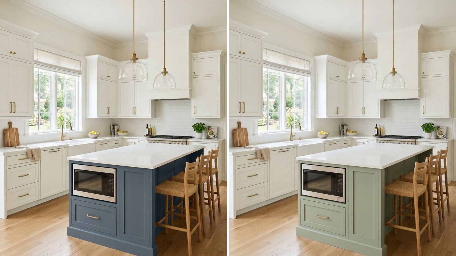
With white cabinets, the island colors that work best are navy like Benjamin Moore Newburyport Blue (HC-155), a muted green like Sherwin-Williams Dried Thyme (SW 6186), and charcoal like Benjamin Moore Kendall Charcoal (HC-166). If you want a softer look, a light sage or a greige such as Saybrook Sage (HC-114) or Mega Greige (SW 7031) works too. Pick the island color by the undertone of your white: cool islands with crisp whites, warm ones with creamy whites.
Codes, hex values and LRV below come from the manufacturers' color data in Muro. The LRV is calculated from the hex value, so it can differ by a point or two from the number on the chip. A hex is also only an approximation on your screen. Paint a sample board and stand it next to your cabinets before you decide.
This guide is only about the island. If you are still picking the cabinet color itself, start with the best kitchen cabinet paint colors.
Start with the white you already have
"White cabinets" covers a lot of ground. A crisp white with a hint of gray and a creamy white with yellow in it pull the island in different directions. Hold a sheet of printer paper against a cabinet door. If the door looks yellow or beige next to it, you have a warm white. If it looks almost the same or slightly gray, it's a clean or cool white.
| Brand | Color | Code | Hex | LRV (calc.) | Leans |
|---|---|---|---|---|---|
| Benjamin Moore | Chantilly Lace | 2121-70 | #F4F6F1 | 91.5 | clean |
| Sherwin-Williams | Extra White | SW 7006 | #EEEFEA | 85.9 | clean, slightly cool |
| Sherwin-Williams | Alabaster | SW 7008 | #EDEAE0 | 82.2 | warm, creamy |
Clean whites like Chantilly Lace and Extra White are easy with navy, blue-gray and charcoal. Alabaster and other creamy whites look better next to olive, sage, greige and warm charcoal. A cold blue-gray island next to a creamy white can make the cabinets look yellowed.
How much contrast do you want?
LRV tells you how much light a color reflects, from 0 for black to 100 for pure white. Your cabinets are somewhere around 82 to 92. The gap between that and the island decides how much the island stands out.
- Island LRV around 35 to 50: a soft, tonal kitchen. The island reads as a different piece of furniture, but nothing jumps out.
- Around 15 to 25: a clear two-tone look that still feels relaxed.
- Under 10: a bold, graphic island. It anchors the room and hides scuffs, but it also shows dust and fingerprints on a matte finish.
In a narrow kitchen with one window, a mid-tone usually looks better than near-black.
Navy and blue-gray islands
Navy is the classic choice for an island with white cabinets. It looks like a color without fighting the white, and brass or gold hardware stands out on it. Blue-gray versions are calmer and good if you're not sure about blue.
| Brand | Color | Code | Hex | LRV (calc.) |
|---|---|---|---|---|
| Benjamin Moore | Newburyport Blue | HC-155 | #465566 | 8.8 |
| Benjamin Moore | Van Deusen Blue | HC-156 | #485B6E | 10 |
| Sherwin-Williams | Sea Serpent | SW 7615 | #3E4B54 | 6.7 |
Newburyport Blue is a medium-dark navy with a little gray in it, so it doesn't look loud. Van Deusen Blue is a touch lighter and bluer. Sea Serpent is darker and grayer, close to a blue charcoal, and good when you want navy that barely admits it. All three sit best next to clean whites. With Alabaster, pick Sea Serpent, since it has the least blue to clash with the cream. There's a longer comparison of navies and their undertones in best navy blue paint colors.
Green islands, from sage to olive
Green is the friendliest island color for warm whites. It goes with wood floors, butcher block and brass, and it doesn't feel as heavy as navy or black.
| Brand | Color | Code | Hex | LRV (calc.) |
|---|---|---|---|---|
| Benjamin Moore | Saybrook Sage | HC-114 | #B1B7A2 | 45.8 |
| Sherwin-Williams | Evergreen Fog | SW 9130 | #95978A | 30.4 |
| Sherwin-Williams | Dried Thyme | SW 6186 | #7B8070 | 20.8 |
| Farrow & Ball | Green Smoke | 47 | #737C70 | 19.2 |
| Sherwin-Williams | Rookwood Dark Green | SW 2816 | #565C4A | 10.1 |
Saybrook Sage is light and gray-green, a gentle step away from white. Evergreen Fog is a gray-green in the middle range. Dried Thyme and Green Smoke are the two to test first if you want the island to read clearly green: Dried Thyme leans olive and warm, Green Smoke a little cooler and more blue-green. Rookwood Dark Green is a deep olive for a dark island next to creamy cabinets.
Charcoal and soft black islands
Charcoal looks modern and goes with almost any white. It's the safe bet if you have a busy countertop or patterned backsplash and don't want another color in the mix.
| Brand | Color | Code | Hex | LRV (calc.) |
|---|---|---|---|---|
| Benjamin Moore | Kendall Charcoal | HC-166 | #676662 | 13.3 |
| Sherwin-Williams | Peppercorn | SW 7674 | #585858 | 9.8 |
| Sherwin-Williams | Cyberspace | SW 7076 | #44484D | 6.4 |
| Benjamin Moore | Wrought Iron | 2124-10 | #494A4B | 6.8 |
Kendall Charcoal is a warm, slightly brown gray, so it works with Alabaster as well as with crisp whites. Peppercorn is a neutral mid-dark gray. Cyberspace and Wrought Iron are soft blacks: Cyberspace has a faint blue cast, which suits clean whites and stainless appliances, and Wrought Iron is a neutral soft black.
Greige and taupe for a quiet two-tone
If navy or black feels like too much, a greige island gives you two tones without a strong contrast. It works well in open kitchens where the island faces the living room and you want it to feel like furniture.
| Brand | Color | Code | Hex | LRV (calc.) |
|---|---|---|---|---|
| Benjamin Moore | Pashmina | AF-100 | #BBB2A1 | 45 |
| Sherwin-Williams | Mega Greige | SW 7031 | #ADA295 | 36.9 |
Pashmina is a light, warm greige. Mega Greige is a bit deeper, with some gray to balance the beige. Both belong with warm whites. Next to a very clean white like Chantilly Lace they can look muddy, so test them there first.
Quick pairings
| Cabinets | Island | What you get |
|---|---|---|
| Chantilly Lace (2121-70) | Newburyport Blue (HC-155) | Crisp, classic navy and white |
| Extra White (SW 7006) | Cyberspace (SW 7076) | Modern, high contrast |
| Extra White (SW 7006) | Van Deusen Blue (HC-156) | Brighter blue, coastal |
| Alabaster (SW 7008) | Dried Thyme (SW 6186) | Warm, cottage feel |
| Alabaster (SW 7008) | Kendall Charcoal (HC-166) | Warm and grounded |
| Alabaster (SW 7008) | Mega Greige (SW 7031) | Soft, tonal |
What to avoid with a painted island
- Ignoring the undertone of your white. A cool blue island against creamy cabinets is the most common mismatch.
- An island color that's almost the cabinet color. A white island next to a slightly different white just looks like a paint mistake. Go clearly darker.
- Picking the island before the countertop. The top covers the island, so test the paint against your actual stone or wood sample.
- Wall paint on the island. It gets kicked by stools and wiped every day. Use a cabinet enamel in satin or semi-gloss; the paint finish guide explains the sheens.
- A third strong color on the walls. With white cabinets and a navy or green island, keep the walls light and quiet. Our guide to the best paint colors for kitchens has wall options.
How to check a color before you buy
- Paint a large sample board, at least the size of a cabinet door, and lean it against the island at floor level.
- Look at it in the morning, in the evening and with the pendant lights on. Greens and charcoals warm up a lot under warm bulbs, and navy can turn almost black at night.
- Hold the countertop sample and a piece of hardware against it at the same time.
Muro won't repaint the island for you, since it paints walls, but the wall is the third color in this picture and the one people usually get wrong. Take a photo of your kitchen, pick a real paint by name or code, for example from the tables above, and see it on your own walls next to the white cabinets and the island. In the iPhone app you can check it by day, at sunset and at night, with the lamps on or off. You can also start in your browser at app.usemuro.com.
FAQ
What color should a kitchen island be with white cabinets?
Navy, muted green or charcoal are the most reliable choices. Benjamin Moore Newburyport Blue (HC-155) works with crisp whites, Sherwin-Williams Dried Thyme (SW 6186) with creamy whites, and Benjamin Moore Kendall Charcoal (HC-166) with both.
Should the kitchen island be darker than the cabinets?
Usually yes. A darker island hides scuffs from stools and feet and gives the kitchen a clear anchor. Aim for an LRV well below your cabinets, for example around 20 for Dried Thyme against about 82 for Alabaster.
What is the best green for a kitchen island?
For a light sage, Benjamin Moore Saybrook Sage (HC-114). For a clear mid-tone green, Sherwin-Williams Dried Thyme (SW 6186) or Farrow & Ball Green Smoke (47). For a deep olive, Sherwin-Williams Rookwood Dark Green (SW 2816).
Does a navy island go with Alabaster cabinets?
It can, but pick a grayer navy like Sherwin-Williams Sea Serpent (SW 7615). A bright, saturated blue can make a creamy white like Alabaster (SW 7008) look yellow.
Is a black kitchen island a good idea?
In a bright kitchen of decent size, yes. A soft black like Benjamin Moore Wrought Iron (2124-10) or Sherwin-Williams Cyberspace (SW 7076) is easier to live with than a pure black. In a small, dim kitchen, a charcoal such as Kendall Charcoal (HC-166) is the safer step.