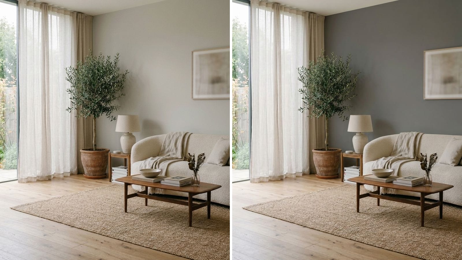
The best warm gray paint colors for most rooms are Repose Gray (SW 7015) and Mindful Gray (SW 7016), at LRV 58 and 48. For a lighter room, go to Classic Gray by Benjamin Moore (1548) or Eider White (SW 7014). For depth, Dorian Gray (SW 7017), and for a dark wall, Chelsea Gray (HC-168) or Kendall Charcoal (HC-166).
A warm gray is still a gray. It just has a little red and yellow in it, so it doesn't turn blue or icy at dusk. That's what separates it from greige, which has visibly more beige. If you're after the beige side, we already have a list of the best greige paint colors. This one stays on the gray side. Codes, hex values and LRV come from the manufacturers' color data in Muro. The LRV is calculated from the hex, not taken from the paint can. A screen is only an approximation, so a sample on your wall decides.
Warm gray or greige: where's the line?
Paint names don't help. Agreeable Gray is called gray and plenty of people call it greige. A quicker check is the hex code itself: subtract the blue value from the red value. The bigger the gap, the warmer and more beige the color. We used that rough measure on the colors in this post and on a few well-known greiges.
| Color | Code | Hex | Red minus blue | Reads as |
|---|---|---|---|---|
| Kendall Charcoal | HC-166 | #676662 | 5 | barely warm gray |
| Repose Gray | SW 7015 | #CCC9C0 | 12 | warm gray |
| Mindful Gray | SW 7016 | #BCB7AD | 15 | warm gray |
| Agreeable Gray | SW 7029 | #D1CBC1 | 16 | the border |
| Revere Pewter | HC-172 | #CBC6B8 | 19 | greige |
| Accessible Beige | SW 7036 | #D1C7B8 | 25 | greige, beige side |
Every warm gray below lands between 5 and 16. Thunder by Benjamin Moore(AF-685, #BDB8AD) scores 16, right at the border, so it is the warmest gray in this post. That's also why Agreeable Gray gets argued about so much: it sits right on the line. We compare it with its closest gray neighbor in Repose Gray vs Agreeable Gray.
It's a rough guide, not a lab test. A color with a high green value can still look cool next to wood, and your light shifts everything.
Light warm grays: LRV 62 to 75
These read as soft off-whites with a gray body. Good for whole-house color, small rooms and anywhere white looked too stark. Next to bright white trim they still read as color, just barely.
| Brand | Color | Code | Hex | LRV (calc.) |
|---|---|---|---|---|
| Benjamin Moore | Classic Gray | 1548 | #E3E0D7 | 74.5 |
| Behr | Guesthouse | UL190-11 | #E3DFD4 | 73.9 |
| Sherwin-Williams | Eider White | SW 7014 | #E2DED8 | 73.4 |
| Farrow & Ball | Ammonite | 274 | #DDD8CF | 69.0 |
| Benjamin Moore | Abalone | 2108-60 | #D3CFC7 | 62.6 |
Classic Gray and Guesthouse are close to swap (ΔE 0.92). Eider White has the least yellow of the three, so it looks a shade cooler, which can feel chilly in a north room. Abalone is the darkest here and starts to look like a real gray on the wall.
Mid warm grays: LRV 48 to 59
This is where most living rooms, hallways and open plans end up. Light enough to keep a room bright, dark enough that white trim and doors stand out.
| Brand | Color | Code | Hex | LRV (calc.) |
|---|---|---|---|---|
| Behr | Winter Haze | HDC-WR14-2 | #CEC9C3 | 58.8 |
| Sherwin-Williams | Repose Gray | SW 7015 | #CCC9C0 | 58.4 |
| Behr | Pumice | MQ6-23 | #BCB9AF | 48.5 |
| Benjamin Moore | Thunder | AF-685 | #BDB8AD | 48.1 |
| Sherwin-Williams | Mindful Gray | SW 7016 | #BCB7AD | 47.6 |
Repose Gray is the safe pick. It's warm enough to sit next to oak floors and cool enough to work with gray tile or stainless steel. Winter Haze is the closest Behr shade (ΔE 2.07). Close, but paint a sample of both if you're switching.
Mindful Gray is the next number after Repose Gray (SW 7015, SW 7016) and a clear step darker in the same family, so the two work well together, say Repose in the living room and Mindful in the hall. Thunder by Benjamin Moore is practically the same color as Mindful Gray (ΔE 0.53), and Behr Pumice is very close too (ΔE 1.13).
Deeper warm grays: LRV 38 to 39
These start to feel moody in a dim room and calm in a bright one. They look good on all four walls of a big, sunny living room, or behind a bed.
| Brand | Color | Code | Hex | LRV (calc.) |
|---|---|---|---|---|
| Sherwin-Williams | Dorian Gray | SW 7017 | #ACA79E | 38.9 |
| Behr | Moleskin | N180-4 | #ABA6A0 | 38.5 |
Dorian Gray (SW 7017) is the next step down from Mindful Gray in the same family. Moleskin is the closest Behr match (ΔE 1.55) and has a little less yellow in it.
Dark warm grays and charcoal: LRV 13 to 24
Use them on cabinets, an island, a front door, an office, or one wall behind a sofa. Next to a warm white they look soft. Next to black they look brown.
| Brand | Color | Code | Hex | LRV (calc.) |
|---|---|---|---|---|
| Farrow & Ball | Mole's Breath | 276 | #8B857F | 23.8 |
| Behr | Pier | PPU8-22 | #87857E | 23.4 |
| Benjamin Moore | Chelsea Gray | HC-168 | #86847C | 23.0 |
| Sherwin-Williams | Gauntlet Gray | SW 7019 | #78736E | 17.4 |
| Behr | Unpredictable Hue | MQ2-58 | #77736D | 17.3 |
| Benjamin Moore | Kendall Charcoal | HC-166 | #676662 | 13.3 |
Chelsea Gray and Behr Pier are practically identical (ΔE 0.65). The same goes for Gauntlet Gray and Unpredictable Hue (ΔE 0.94). Kendall Charcoal is the least warm gray in this whole post. On a kitchen island or a front door it reads as a soft charcoal rather than black.
Warm gray in north- and south-facing rooms
North light is cool and even. It pulls every gray toward blue, so a warm gray is usually the right call there, and a lighter one than you'd think. Repose Gray or Classic Gray will look calmer in a north room than on the chip. Mindful Gray and darker can go flat and a bit gloomy with one small window. More on that in our guide to north-facing room paint colors.
South and west light is warm, especially in the afternoon. It pushes warm grays toward beige. If Repose Gray looked too beige in your sunny room, the light did that, not the paint. There you can go a step darker (Mindful Gray, Dorian Gray) without the room feeling heavy.
What to avoid with warm gray
- Picking by name. Abalone, Thunder and Moleskin don't say "gray" anywhere, and Agreeable Gray isn't fully gray. Look at the hex and the sample.
- A stark blue-white trim. It makes a warm gray look dirty. A soft, slightly warm white works better.
- Mixing warm and cool grays in one view. Repose Gray next to a cool blue-gray in the next room makes both look off. Stay in one family through open spaces.
- Going too dark in a dim room. Dorian Gray in a north room with one window can look muddy. Test it first, or move up a step.
- Judging from a small sample on a white wall. A small square surrounded by white looks darker and grayer than a full wall.
How to check a color before you buy
- Pick two or three grays at different depths, for example Repose Gray, Mindful Gray and Dorian Gray, which step down in the same family.
- Paint large samples on two walls: one that gets direct light, and one in shade.
- Look at them in the morning, in the afternoon and in the evening with lamps on. Warm bulbs make warm grays look more beige, sometimes a lot.
To narrow the list before you buy samples, you can use Muro. You take a photo of your own room, pick a real paint by name or code, for example from the tables above, and see it on your walls next to your floor and furniture. In the iPhone app you can see the room by day, at sunset and at night, with lamps on or off. You can also start in the browser at app.usemuro.com. When the color is settled, the paint calculator tells you how many gallons to buy.
FAQ
What is the best warm gray paint color?
For most rooms, Repose Gray by Sherwin-Williams(SW 7015, LRV 58.4 calculated). It's light, clearly gray, and warm enough not to look cold at night. If you want it a step darker, Mindful Gray (SW 7016).
Is Agreeable Gray a warm gray or a greige?
It sits right on the border. Its hex has more red and yellow than Repose Gray and less than Revere Pewter. Most people see it as a light greige. Our Agreeable Gray review covers it in detail.
What is the best light warm gray?
Classic Gray by Benjamin Moore (1548), with an LRV of 74.5 calculated, or Eider White by Sherwin-Williams (SW 7014). Classic Gray is a little warmer, Eider White a little cooler.
What is a good dark warm gray?
Chelsea Gray by Benjamin Moore (HC-168) for a mid-dark wall or cabinets, or Kendall Charcoal (HC-166) when you want close to charcoal without going black. Behr Pier (PPU8-22) is a near twin of Chelsea Gray.
Does warm gray go with wood floors?
Yes, that's where it beats cool gray. Repose Gray and Mindful Gray work with oak and walnut. With orange-toned floors, test a sample right next to the floor, because the floor will make the gray look cooler.
What is the Benjamin Moore equivalent of Mindful Gray?
Thunder (AF-685), with a ΔE of 0.53, which is practically identical.