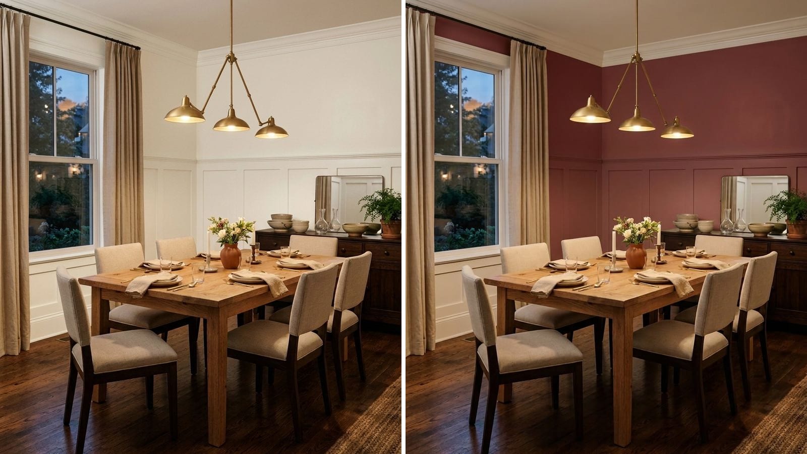
The best dining room paint colors are warm off-whites like Sherwin-Williams Alabaster (SW 7008) if the room opens onto the kitchen or living room, and deeper colors if it has its own walls: greige, a gray-green like Pewter Green (SW 6208), navy like Benjamin Moore Hale Navy (HC-154), brick red or clay, or a dark bronze. A dining room is used mostly in the evening, so pick the color under lamplight, not at noon.
Codes, hex values and LRV in the tables come from the manufacturers' color data in Muro. LRV (how much light a color reflects, from 0 for black to 100 for white) is calculated from the hex, so the number on the manufacturer's chip can be off by a point or two. A screen only gives you an approximation of a paint color. The sample on your own wall decides.
Start with two questions
Can you see the dining area from the kitchen or living room? In an open plan the dining walls are usually the same walls as the rest of the space. Here you either stay with the main color of the house or paint one clear section, like the wall behind the sideboard. We wrote more about this in how to make paint colors flow from room to room.
When do you actually eat there? If the room is mostly for dinners and holidays, it spends most of its life under warm bulbs and a pendant over the table. Dark and saturated colors look their best in that light. A room you also use for homework or laptop work at 10 a.m. needs more daylight bounce, so stay lighter.
North light makes colors cooler and grayer, south light warms them. And wood furniture pulls everything toward orange, so a cold gray next to an oak table can look dirty.
What to avoid in a dining room
- A stark, cool white under warm pendant light. In the evening it goes flat and slightly yellow anyway, and in the day it reads clinical next to wood.
- Mid-tone grays with a blue cast in a room with little daylight. At dinner they turn heavy and dull without the depth of a real dark color.
- Flat matte paint at chair height if you have kids. Eggshell or satin wipes clean more easily. The paint finish guide covers which sheen goes where.
1. Warm off-white, when the dining room is part of an open plan
When the table stands between the kitchen and the sofa, the safest move is the same warm white everywhere. These whites have a little yellow or beige in them, so they don't turn icy in the evening and they sit well next to wood.
| Brand | Color | Code | Hex | LRV |
|---|---|---|---|---|
| Sherwin-Williams | Alabaster | SW 7008 | #EDEAE0 | 82.2 |
| Sherwin-Williams | Greek Villa | SW 7551 | #F0ECE2 | 84 |
| Benjamin Moore | Swiss Coffee | OC-45 | #EEECE1 | 83.6 |
| Behr | Whisper White | HDC-MD-08 | #F5F3ED | 89.6 |
Whisper White is the cleanest of the four, a good pick if your cabinets are white and you don't want the walls to look creamy next to them.
2. Greige and warm beige, the safe middle
A step darker than white. Greige makes sense if the dining room has its own walls but you don't want to commit to a strong color, or if you plan to sell within a few years.
| Brand | Color | Code | Hex | LRV |
|---|---|---|---|---|
| Sherwin-Williams | Accessible Beige | SW 7036 | #D1C7B8 | 57.9 |
| Benjamin Moore | Revere Pewter | HC-172 | #CBC6B8 | 56.5 |
| Benjamin Moore | Pale Oak | OC-20 | #DDD9CE | 69.5 |
| Behr | Sculptor Clay | PPU5-08 | #CCC3B6 | 55.2 |
Pale Oak is the lightest here and works in a north-facing room that needs every bit of light. Accessible Beige and Revere Pewter are close in depth. Accessible Beige reads warmer, Revere Pewter a little grayer.
3. Gray-green and deep green
Green is an easy color to live with in a dining room. It goes with wood, brass, linen and plants, and it doesn't fight with food. Gray-greens are the easy entry. Bottle green is for a room you want to feel like a restaurant.
| Brand | Color | Code | Hex | LRV |
|---|---|---|---|---|
| Farrow & Ball | Card Room Green | 79 | #899081 | 26.8 |
| Sherwin-Williams | Pewter Green | SW 6208 | #5E6259 | 11.8 |
| Behr | Royal Orchard | PPU11-01 | #5F6C5A | 13.9 |
| Benjamin Moore | Salamander | 2050-10 | #2F3E3E | 4.4 |
Card Room Green is light enough for a room that also gets used during the day. Pewter Green and Royal Orchard are mid-dark: Royal Orchard is the greener one, Pewter Green leans gray. Salamander is almost black with a blue-green cast, so it only makes sense with good lighting and a white or wood ceiling.
4. Navy and dark blue
Navy is a classic in dining rooms with white trim and wainscoting. Under warm light it goes softer and slightly gray, which is why people who are scared of it in the store often like it at dinner.
| Brand | Color | Code | Hex | LRV |
|---|---|---|---|---|
| Benjamin Moore | Hale Navy | HC-154 | #434B56 | 6.9 |
| Sherwin-Williams | Naval | SW 6244 | #2F3D4C | 4.5 |
| Behr | Very Navy | M500-7 | #233B5E | 4.3 |
| Farrow & Ball | Hague Blue | 30 | #3D4E57 | 7.1 |
Hale Navy is the grayest and the easiest to live with. Very Navy is a true, saturated blue. Hague Blue leans toward teal and looks great with brass. If you are choosing between the two most popular ones, read Hale Navy vs Naval.
5. Red, brick and clay
Red dining rooms have been around for a long time. Farrow & Ball even named one of its colors Eating Room Red. The reds that work today are browner, closer to brick and wine than to fire-engine red. Clay and terracotta give a lighter, sunnier version of the same warmth.
| Brand | Color | Code | Hex | LRV |
|---|---|---|---|---|
| Sherwin-Williams | Cavern Clay | SW 7701 | #AC6B53 | 19.9 |
| Farrow & Ball | Eating Room Red | 43 | #8F4E4D | 11.8 |
| Behr | Red Pepper | PPU2-02 | #7A3F39 | 8 |
| Benjamin Moore | Caliente | AF-290 | #8A2728 | 7 |
| Sherwin-Williams | Rookwood Red | SW 2802 | #622F2D | 4.8 |
Cavern Clay is the gentlest start and fits Southwestern or Spanish-style homes. Eating Room Red and Red Pepper are muted, a bit brown. Caliente is the brightest real red on the list, so test it on a large board first. Rookwood Red is an oxblood that reads almost brown at night.
6. Bronze, charcoal and soft black
If you want the room dark but not colored, go for a warm charcoal or bronze. With a wood table and candlelight these look rich. Paint the ceiling a shade lighter or the same color, not bright white, or the white will look like a lid.
| Brand | Color | Code | Hex | LRV |
|---|---|---|---|---|
| Sherwin-Williams | Urbane Bronze | SW 7048 | #54504A | 8.1 |
| Behr | Cracked Pepper | PPU18-01 | #4F5152 | 8.2 |
| Sherwin-Williams | Iron Ore | SW 7069 | #434341 | 5.6 |
| Sherwin-Williams | Tricorn Black | SW 6258 | #2F2F30 | 2.9 |
Urbane Bronze is the warmest of these, with a hint of brown. Cracked Pepper and Iron Ore are neutral charcoals. Tricorn Black is close to true black and works best on one wall or below a chair rail. If dark colors are new to you, the moody paint colors guide for beginners walks through ceilings, trim and lighting.
How to check a color before you buy
Paint samples at least the size of a sheet of poster board and put them where the table is, not by the window. Then look at them at the time you usually eat, with your normal lights on. Check two or three colors at once, because one sample on a white wall always looks darker and louder than a finished room.
To get the list down before you buy samples, you can try the colors in Muro. You take a photo of your dining room, pick a real paint by name or code, for example from the tables above, and see it on your own walls next to your own table. In the iPhone app you can switch the same photo between day, sunset and night, with the lamps on or off, which matters a lot for a room you use after dark. You can also start in the browser at app.usemuro.com. Once you have decided, the paint calculator tells you how much to buy.
FAQ
What is a good neutral color for a dining room?
A warm off-white like Alabaster (SW 7008) if the dining area is part of an open plan, or a greige like Accessible Beige (SW 7036) or Revere Pewter (HC-172) if it has its own walls. Both sit well next to wood furniture.
Should a dining room be light or dark?
If you eat there mostly in the evening and the room has its own walls, dark works very well, because it looks its best under warm lamps. If the room is open to the kitchen or also serves as a home office, stay with a light or mid-tone color such as Accessible Beige (SW 7036).
What color makes a small dining room look bigger?
A light warm white like Alabaster (SW 7008) on walls and ceiling, so there are no hard edges. A very dark color like Iron Ore (SW 7069) can also work, because the corners disappear in the evening, but it won't make the room look brighter.
Is red a good color for a dining room?
Yes, if you choose a muted brick or wine red such as Eating Room Red by Farrow & Ball (43) or Red Pepper by Behr (PPU2-02) rather than a bright primary red. Test it under your evening lighting first.
What color goes with a wood dining table?
Most warm colors do: creamy whites, greige, gray-green, navy and clay all sit well next to oak and walnut. Cool grays with a blue cast are the ones to be careful with, because wood makes them look dirty.