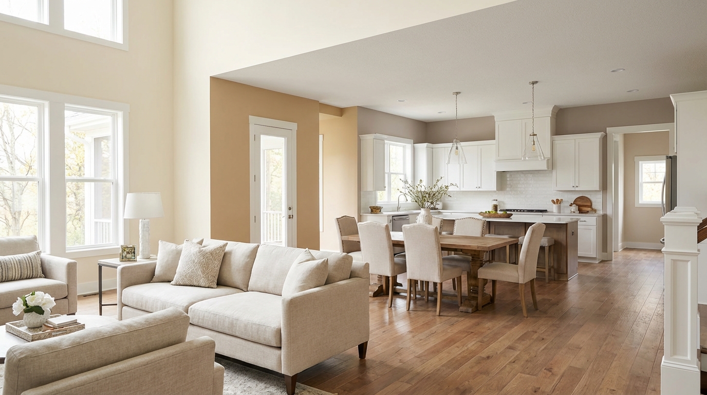
Start with one neutral for your hallways, then branch out with colors that share the same undertone family. Keep LRV differences under 15 points between adjacent rooms. That's the formula for a home that feels intentional instead of random.
A common version of this mistake: a cool gray living room (undertone: blue), a warm beige hallway (undertone: yellow), and a green-tinged white kitchen. Every doorway feels like a jarring transition, and the house ends up feeling like three different spaces assembled by accident.
Here's how to avoid it.
Why color flow matters
When colors don't flow:
- Each room feels disconnected
- Transitions feel jarring—like visual speed bumps
- Your home feels smaller (rooms don't expand visually into each other)
- Decorating becomes a puzzle with no solution
When colors flow:
- Spaces feel connected and intentional
- Rooms visually borrow space from each other
- The home feels larger
- Furniture and decor work throughout the house
Good color flow doesn't mean painting everything the same color. It means the colors have a relationship that feels deliberate.
The 5-step system
Step 1: Choose your base neutral
Pick one neutral color that will appear in hallways, transitions, and any walls visible from multiple rooms. This is your connecting thread.
Good base neutrals:
- Agreeable Gray SW 7029 (LRV 60) — Warm greige, works with almost everything
- Pale Oak OC-20 (LRV 70) — A beige-gray that goes with most things
- Edgecomb Gray HC-173 (LRV 63) — Slightly warm, a bit more polished
- Accessible Beige SW 7036 (LRV 58) — Warm, easy to live with
Your base neutral appears in:
- Hallways (critical—this connects everything)
- Stairwells
- Open spaces between rooms
- Any wall visible from multiple angles
Agreeable Gray is a popular base for this reason: it's forgiving, works with both warm and cool accents, and photographs well (which matters if you're ever selling).
Step 2: Lock in your undertone family
Your base color has undertones. Every other color in your home should share that undertone family.
Warm undertone family:
- Yellow, cream, peach, coral
- Golden brown, tan
- Colors that feel like sunlight
Cool undertone family:
- Blue, gray, green
- Colors that feel like shade
If your base is Agreeable Gray (warm greige):
- Accent colors should lean warm
- Avoid ice-cold blues, pure grays, mint greens
- Stick to warm creams, soft terracottas, muted golds
If your base is Wickham Gray (cool gray):
- Accent colors should lean cool
- Avoid yellow-creams, orange-tinged beiges
- Stick to blue-grays, true whites, cool greens
Mixing undertone families is the #1 cause of "something feels off" color schemes. Two beautiful individual colors can look terrible together simply because one has warm undertones and the other has cool.
Step 3: Keep LRV differences under 15 points
LRV (Light Reflectance Value) measures how light or dark a color appears. Colors with similar LRVs transition smoothly. Large jumps feel abrupt.
Smooth transition:
- Living room: LRV 65
- Hallway: LRV 60
- Kitchen: LRV 70
- Bedroom: LRV 55
Everything within 10-15 points. The transitions feel natural.
Jarring transition:
- Living room: LRV 80 (very light)
- Hallway: LRV 35 (medium-dark)
- Kitchen: LRV 90 (almost white)
- Bedroom: LRV 20 (dark)
30-40 point swings between rooms. Every doorway feels like a shock.
Aim to stay within a 15-point LRV range for all connected spaces. The usual exceptions are private rooms with doors (bathrooms, closets).
Step 4: Use 60-30-10 within each room
Within each room:
- 60% dominant color (walls)
- 30% secondary color (furniture, curtains)
- 10% accent color (pillows, art, accessories)
Here's the cohesion trick: repeat accent colors across rooms. The throw pillow color in your living room can appear in kitchen accessories, bedroom art, and bathroom towels. This creates rhythm throughout the house.
Step 5: Test the sightlines
This is the step most people skip. Walk through your house and stand in every doorway. Look at the two rooms simultaneously.
Ask yourself:
- Do these colors complement or clash?
- Does one room make the next look wrong?
- Is the transition smooth or jarring?
If something feels off, it probably is. Trust the uncomfortable feeling.
Strategies by home type
Open floor plan
When kitchen, living, and dining areas are one continuous space, you have limited options:
Best approach: One wall color throughout, with accent walls for definition.
Works well:
- Same color on all walls
- Single accent wall behind TV or in dining area
- Different sheen levels to define zones (not different colors)
- Varying ceiling treatments
Avoid:
- Multiple wall colors visible simultaneously
- Accent walls that compete for attention
- Drastic color changes within sightlines
In an open kitchen/living room, the same wall color everywhere works best — let furniture and art create the zones, not the paint.
Traditional floor plan
Separate rooms with defined doorways give you more freedom:
Best approach: Different colors per room, same undertone family, similar LRVs.
Example palette:
- Hallway: Agreeable Gray SW 7029 (LRV 60) — warm greige base
- Living room: Accessible Beige SW 7036 (LRV 58) — warmer variation
- Kitchen: Alabaster SW 7008 (LRV 82) — warm white
- Bedroom: Mindful Gray SW 7016 (LRV 48) — same family, darker
All warm undertones, all within reasonable LRV range.
Half-and-half layout
Many homes have open areas (kitchen/living) plus closed rooms (bedrooms/bathrooms):
Best approach: Strict cohesion in open areas, more freedom in private rooms.
Open zones: Stick to base neutral, no experiments Private rooms with doors: More color freedom—these don't need to match as precisely
Room-by-room relationships
Living room to kitchen
These are almost always visually connected. Keep them:
- Same color family
- Within 10 LRV points
- Consistent undertones
Warm greiges one shade apart — one for the living room, a slightly lighter one for the kitchen — read together as a palette, not a mistake.
Hallway to everything
Hallways are the most important color decision. Every room connects through them.
- Use your base neutral in hallways
- Make sure every room visible from the hallway coordinates
- When in doubt, make the hallway lighter than adjacent rooms
Bedrooms to hallways
Bedrooms can diverge more since doors are usually closed. But the entrance matters.
The rule: paint the wall visible from the hallway in your base neutral or a close relative. Put accent colors on walls that face the bed, not the door.
Bathrooms
Guest bathrooms visible from common areas should coordinate. Master baths have more freedom since they're private.
A complete palette example
Here's a complete palette that follows this system:
| Zone | Color | LRV | Undertone |
|---|---|---|---|
| Hallways | Agreeable Gray SW 7029 | 60 | Warm greige |
| Living Room | Accessible Beige SW 7036 | 58 | Warm beige |
| Kitchen | Alabaster SW 7008 | 82 | Warm white |
| Master Bedroom | Mindful Gray SW 7016 | 48 | Warm gray |
| Guest Bedroom | Worldly Gray SW 7043 | 57 | Warm greige |
| Guest Bathroom | Sea Salt SW 6204 | 63 | Blue-green |
| All Trim | Extra White SW 7006 | 86 | Clean white |
Everything warm-leaning. LRVs mostly in the 50-65 range with kitchen lighter for brightness. One cool accent (Sea Salt) in the isolated guest bath.
Common mistakes
Mistake 1: Ignoring undertones
A cool gray living room next to a warm beige hallway creates visual conflict at every transition. It's one of the most common color-flow mistakes.
Mistake 2: Too many colors
Five different wall colors in a 1,500 sq ft home looks chaotic. Limit yourself to 3-4 colors maximum, excluding trim and ceilings.
Mistake 3: Forgetting flooring
Your floor color runs throughout the house. Every wall color must work with it. If your floors have warm undertones, cool wall colors will clash everywhere.
Mistake 4: Testing rooms in isolation
Test colors while standing in doorways, looking at adjacent rooms together. Individual room testing leads to unconnected results.
Mistake 5: Ignoring natural light
North-facing rooms need warmer colors than south-facing rooms to feel equivalent. A color that works in your sunny living room might feel depressing in the dark hallway.
Fixing existing clashes
Already have mismatched rooms? Options:
- Repaint to matching undertones — The complete fix, also the most work
- Add a transition zone — Paint the hallway between clashing rooms a bridging color
- Use furniture and rugs — Decor can create visual bridges between wall colors
- Close the doors — Seriously, sometimes isolation is the solution
Make every doorway feel intentional
Creating color flow requires:
- One base neutral for hallways and shared spaces
- Consistent undertones across all colors
- Similar LRVs (within 10-15 points)
- Testing at transitions -- the doorway view matters most
When colors share undertone families and similar brightness levels, even different hues feel connected. The result is a home that feels intentional and bigger than it actually is.
Test everything with samples before committing. Use Muro to quickly compare options on your actual walls. And remember—when in doubt, keep it simple. A house with three well-chosen colors will always look better than one with seven random ones.