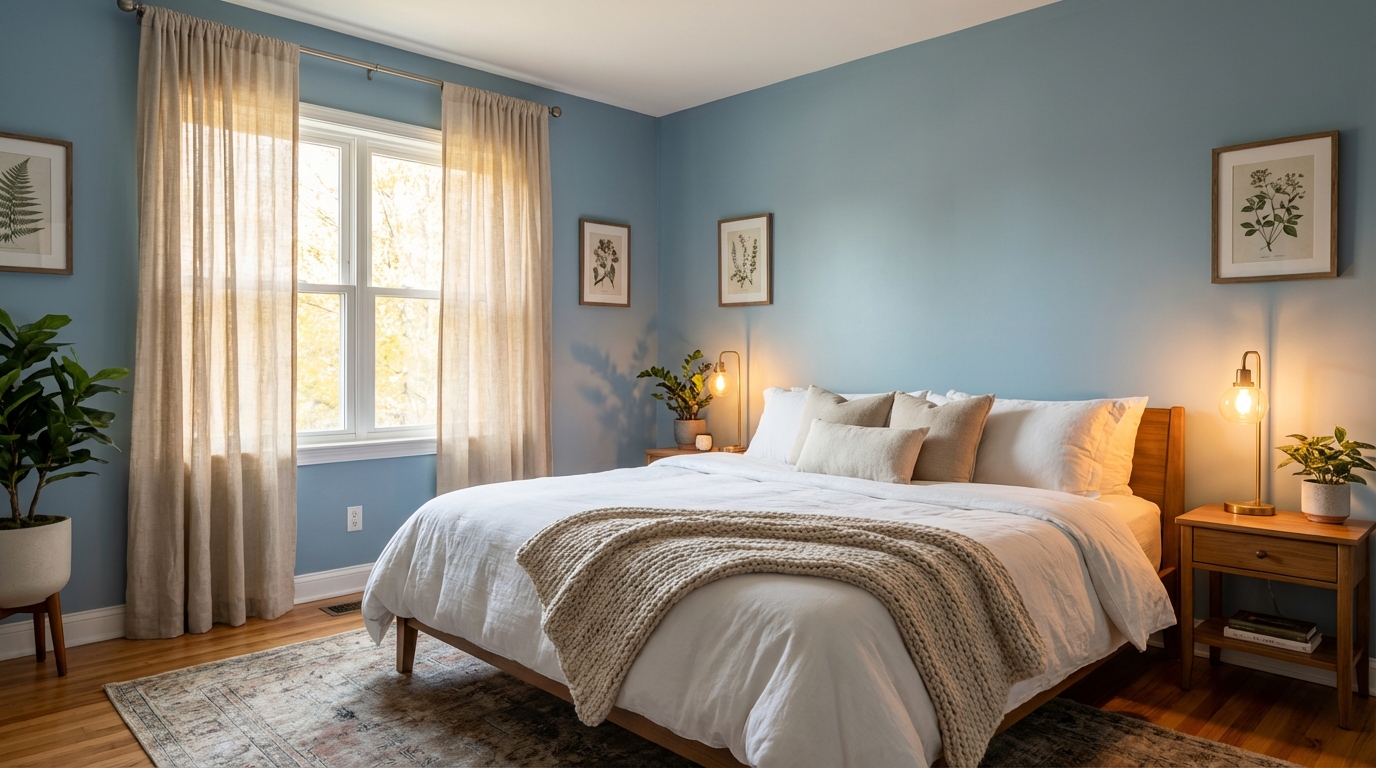
Blue, green, and warm neutrals with LRV between 50-70 are the safest picks for a bedroom you want to sleep in. Cool, muted colors tend to feel calming and help a room wind down. Bright whites, energizing yellows, and saturated reds do the opposite.
A bright white bedroom looks clean and modern, but it can feel harsh at night and glaring in the morning. Swapping it for a soft blue-gray, with the same furniture and bedding, changes the whole mood of the room.
What the research says
There's been some research and plenty of surveys on bedroom color and sleep. Take them as a rough guide, not hard science, but the general picture looks like this:
Blue bedrooms: Usually come out on top. Blue is associated with calm, lowers heart rate, and doesn't stimulate the brain.
Green bedrooms: Second best for sleep. Green connects to nature and relaxation. It's easy on the eyes and doesn't create visual tension.
Gray bedrooms: Neutral grays work well, especially warmer grays. Cool grays can feel too cold and clinical.
Purple and brown: Often rated less restful. Purple can be stimulating, and brown can feel heavy or depressing.
Red and orange: Worst for sleep. These colors are energizing by nature. They raise heart rate and create alertness, exactly what you don't want at bedtime.
The best bedroom colors
Soft blues
Blue is the undisputed champion of bedroom colors. But not just any blue.
What works:
- Muted, grayish blues
- Pale sky blues
- Soft slate blues
- LRV range: 50-70
What doesn't work:
- Bright, saturated blues (too stimulating)
- Very dark navy (can feel heavy)
- Blue with strong purple undertones (activating)
Top picks:
Sea Salt by Sherwin-Williams (SW 6204) - A soft blue-green that reads calm and serene
Silver Sage by Benjamin Moore (2150-40) - Muted blue-gray with gentle warmth
Quiet Moments by Benjamin Moore (1563) - Pale blue-gray, very calming
Sleepy Blue by Sherwin-Williams (SW 6225) - The name says it all
Soft greens
Green connects us to nature, which our brains associate with safety and relaxation.
What works:
- Sage greens
- Muted olive tones
- Soft gray-greens
- LRV range: 45-65
What doesn't work:
- Bright lime or kelly green
- Very dark forest green
- Green with strong yellow undertones
Top picks:
Saybrook Sage by Benjamin Moore (HC-114) - Classic sage, not too green
Softened Green by Sherwin-Williams (SW 6177) - Muted and calming
Clary Sage by Sherwin-Williams (SW 6178) - Deeper sage with warmth
Silver Marlin by Benjamin Moore (2139-50) - Gray-green, very soothing
Warm neutrals
If blue and green feel too "colored" for you, warm neutrals work beautifully.
What works:
- Greige (gray-beige)
- Warm gray
- Soft taupe
- Creamy off-whites
- LRV range: 55-75
What doesn't work:
- Cool, stark white (too clinical)
- Yellow-beige (can feel dated and restless)
- Dark charcoal (too heavy for sleep)
Top picks:
Agreeable Gray by Sherwin-Williams (SW 7029) - The perfect warm gray
Pale Oak by Benjamin Moore (OC-20) - Warm greige, very restful
Edgecomb Gray by Benjamin Moore (HC-173) - Refined neutral
Accessible Beige by Sherwin-Williams (SW 7036) - Warm without being yellow
Colors to avoid in bedrooms
Bright white
White seems like a safe choice, but pure white bedrooms can feel:
- Clinical (like a hospital)
- Too bright in morning light
- Cold and unwelcoming
- Harsh on the eyes when you're waking up
If you want white, go for soft, warm whites with LRV around 80-85, not 95+.
Energizing colors
Reds and oranges: These colors raise heart rate and stimulate the nervous system. Great for a home gym, terrible for sleep.
Bright yellows: While warm, bright yellow is energizing and activating. You'll feel awake, which is the opposite of the goal.
Hot pinks and magentas: Stimulating and attention-grabbing. Not relaxing.
Very dark colors
Deep navy, charcoal, and black can feel:
- Cave-like and oppressive
- Heavy and depressing
- Like the walls are closing in
If you want dark and moody, keep it to an accent wall behind the headboard where you won't see it while falling asleep.
Colors with high saturation
The hue matters less than the intensity. A muted sage green is calming. A saturated emerald green is stimulating.
For bedrooms, always lean toward muted, dusty, or grayed-down versions of colors.
The LRV factor
LRV (Light Reflectance Value) matters for bedrooms. Here's why:
Too high (85+): The walls reflect too much light, making the room feel bright and active, especially in the morning.
Too low (below 40): The room feels dark and closed in, which some find comforting but others find oppressive.
The sweet spot (50-70): Enough light reflection to feel open and airy, but soft enough to feel restful.
This is why soft, muted colors work better than either bright whites or deep darks.
What about the accent wall?
If you want color in your bedroom, put it behind the headboard. This is the one wall you don't see while lying in bed.
Good accent wall colors for bedrooms:
- Deeper versions of your main wall color
- Moody blue-greens
- Soft charcoals
- Muted navy
Keep the walls you see while in bed in calming, light neutrals or soft colors.
Ceiling color matters too
Most people paint ceilings white by default. In bedrooms, consider:
Same color as walls (slightly lighter): Creates a cocoon effect that can feel very restful.
Soft warm white: Slightly warmer than pure white to avoid the clinical feel.
Very pale blue: An old trick that makes the ceiling feel like sky. Surprisingly soothing.
Avoid pure white ceilings if your walls are warm colors, as the contrast can feel jarring.
Three common bedroom choices compared
Bright white Looks modern but can feel like sleeping in a hospital room. Morning light bounces everywhere.
Pale gray with blue undertones Better, but it can feel cold in winter and rarely feels cozy.
Soft blue-green, like Sea Salt by Sherwin-Williams (SW 6204) Calm without being boring. Warm enough to be cozy, cool enough to be restful.
Repainting a bedroom costs a gallon or two of paint. For a room you spend a third of your life in, that's a cheap change.
Quick guidelines
For falling asleep faster:
- Blue and blue-green tones
- LRV 50-65
- Matte or eggshell finish (less light reflection)
For staying asleep:
- Avoid colors that are too stimulating
- Keep accent colors behind you
- Make sure morning light doesn't bounce harshly
For waking up rested:
- Warm undertones in your neutral
- Not too dark (avoid the cave effect)
- Soft, not stark
Worth the $50 experiment
Your bedroom should help you sleep, and color plays a bigger role than most people think. Blue and green are the most reliable picks. Warm neutrals work well too. Avoid bright whites, energizing colors, and anything too saturated.
LRV matters. Aim for 50-70 for the best balance of open and restful.
And if you've been struggling with sleep in a bright white or bold-colored bedroom? It might be worth the $50 experiment. A new paint color is a lot cheaper than sleep supplements and weighted blankets.